Panoramic is an intuitive, easy-to-use platform that revolutionizes how lawyers work by allowing them to deliver their best work faster and more confidently, with knowledge resources embedded into the workflow.
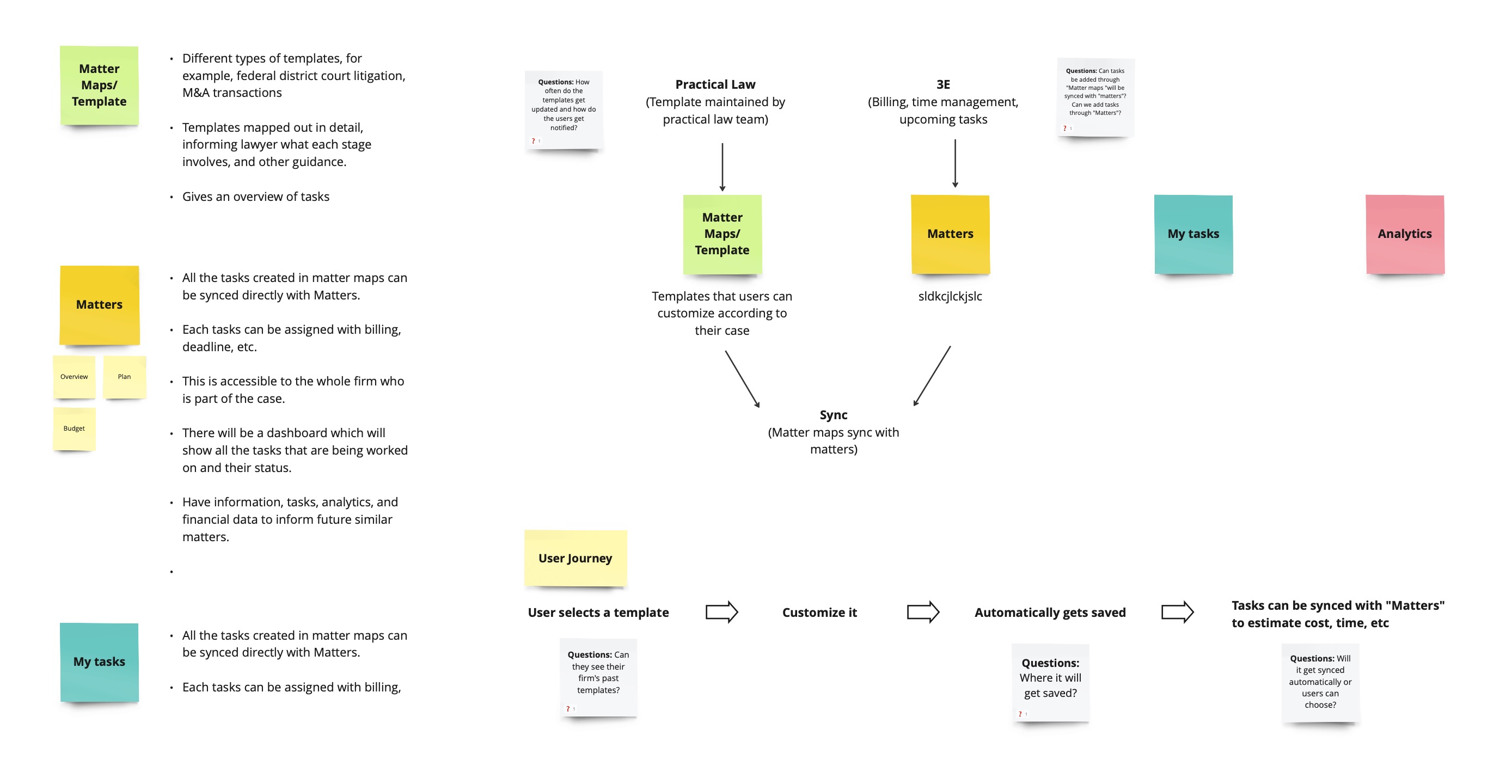
Panoramic's backend is a complex cloud-based system built on TR Practical Law’s legal guidance platform and its 3E financial management system to better connect the front office of a law firm — where the legal work is handled — to the back office — where the firm's financials are monitored and analyzed.
- The whole team had to understand how both Practical Law and 3E applications worked and interacted so that we could align the outputs in the new application.
- Everyone had to build a deep understanding of how the data would be pulled into the new application and used by different personas to meet their diverse needs and skill sets.
- We had to map the data connections to create a more robust application, aiming to present information clearly and logically to help lawyers save time and effort.
I was part of the team when it was at an initial stage, I was involved mainly with two parts of the project (Matter Maps and Matters). I also contributed to their pattern library by creating style guides and design components.
- Tools: Sketch
- Timeline: 8 months
- Role: Visual designer
- Team: 1 creative lead, 3 UX designers, 3 visual designers, 2 researchers, 1 business analyst and 2 developers
This project was a rewarding experience as it pushed me to flex further into information architecture, interaction design, and strategic thinking when I was brought on board purely as a UI designer.
Brainstorming
Based on user research and business team meetings, we brainstormed and documented features for the new application. The team detailed what data would be pulled from TR Practical Law’s legal guidance platform and the 3E financial management system as well as how it will all connect. To ensure Panoramic’s long-term viability, we consolidated all project documentation for easy sharing with the business team and future support staff.
Defining Process
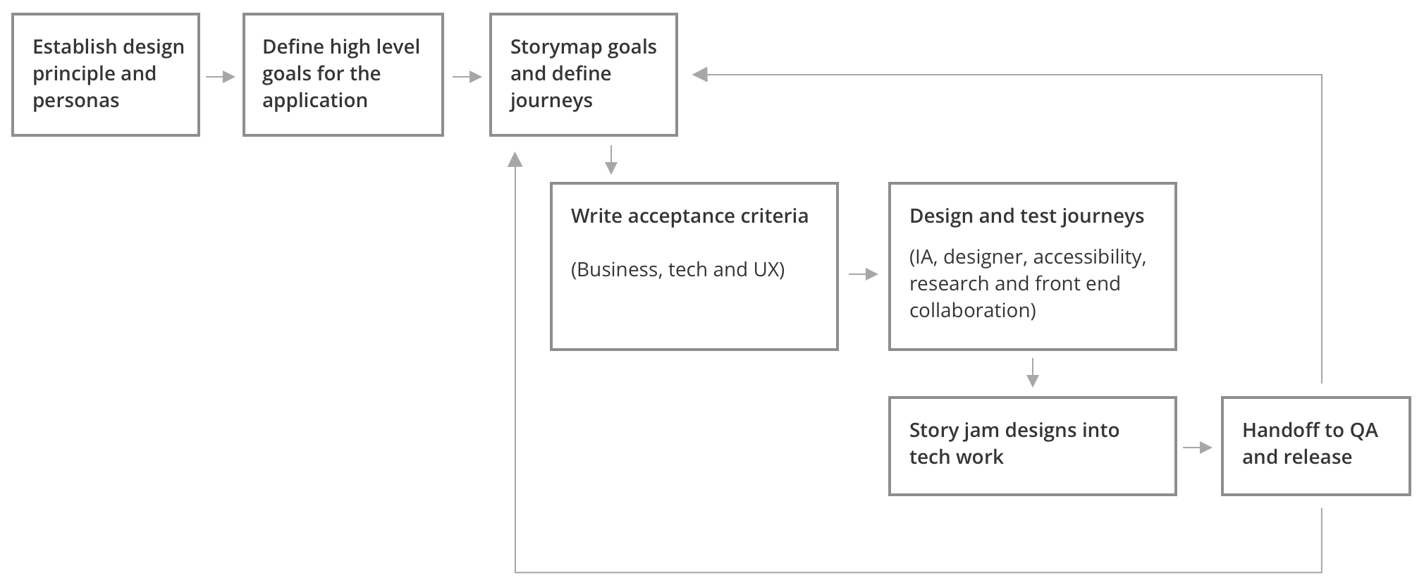
We were intentional with our process on Panoramic. As designers, we set ourselves up with design principles as a true north to make sure we were laddering up our problems to user needs vs. business features.
We then worked with the business team to define high-level user goals that we wanted Panoramic to solve. The next step was to bring our business and tech partners on board so that we were all aligned in our thinking about the principles and personas.
We took those goals (or sub-branches of those goals) through story mapping, defining journeys that we then designed and validated with user research. Once designs were approved, we took them into story jamming with tech to break down the work into iteration chunks, QA, and release (software process).
Wireframes (lo-fidelity)
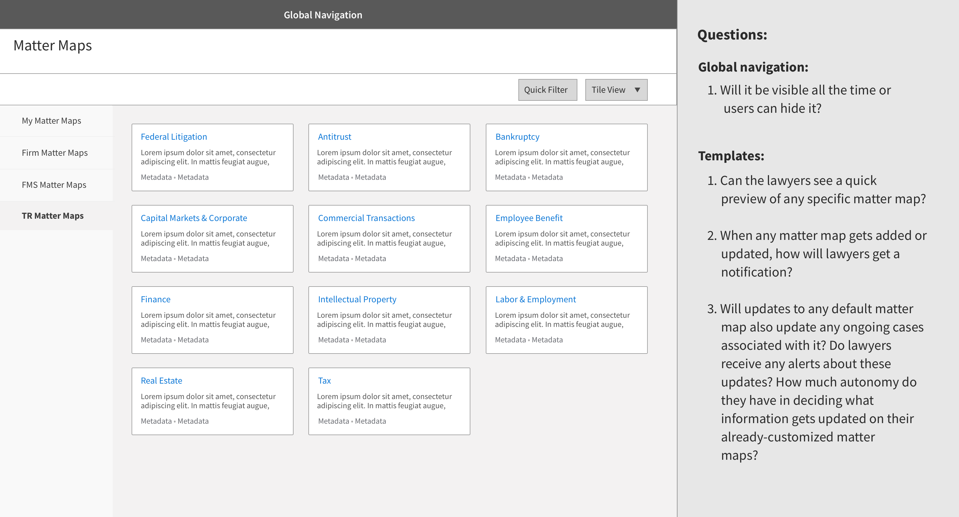
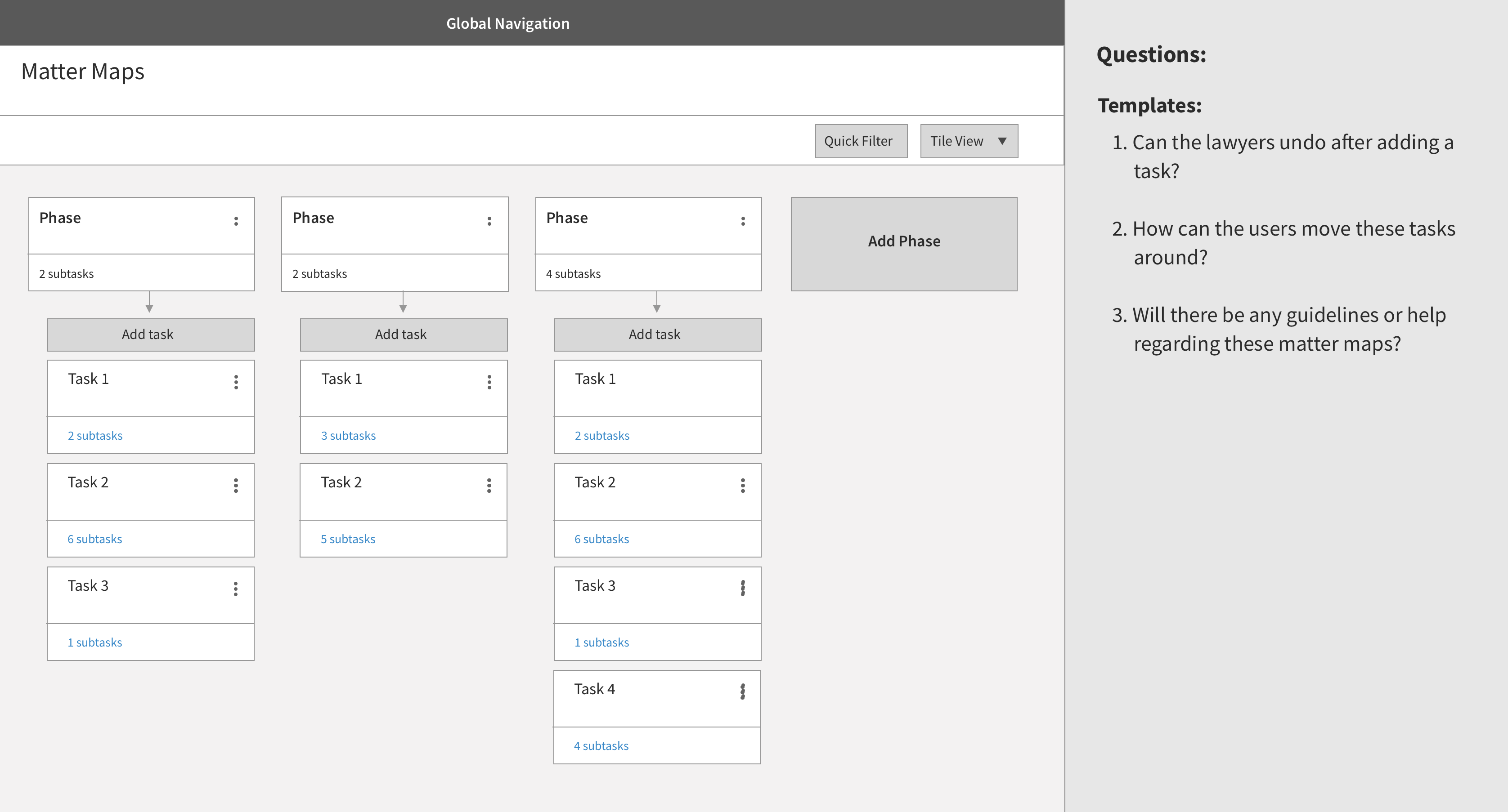
Matter Maps allows users to select and customize templates for their cases. Developed by the lawyers from TR's Practical Law software team, Matter Maps provide clear roadmaps for any legal matter, detailing requisite tasks and guidance for each phase.
As there were no prior wireframes, I started with basic wireframes to understand how the navigation would work and connect with other parts of the project. I also asked a lot of questions and brainstormed about how users would interact with all the features on the screen, looking for any hurdles that users might encounter while doing their tasks.
Wireframes (hi-fidelity)
Once we had the overall structure of the application nailed down, we started adding more details in the navigation. Based on our personas, we created detailed mockups of some of the tasks that the users would be trying to acheive.
Task 1 - moving the tasks
I presented this mockup to the business team, as this was one of the key tasks that users would definitely need to do while working in Matter Maps.
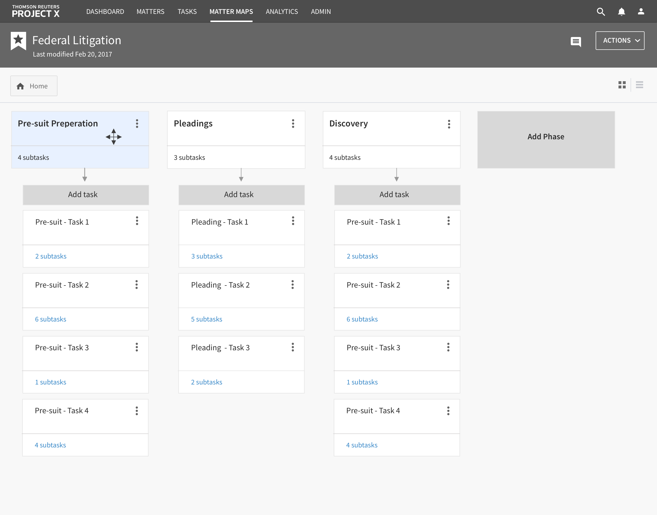
Moving the whole task:
Step 1: When the user hovers over a non-interactive area, the icon changes to indicate that the task can be dragged.
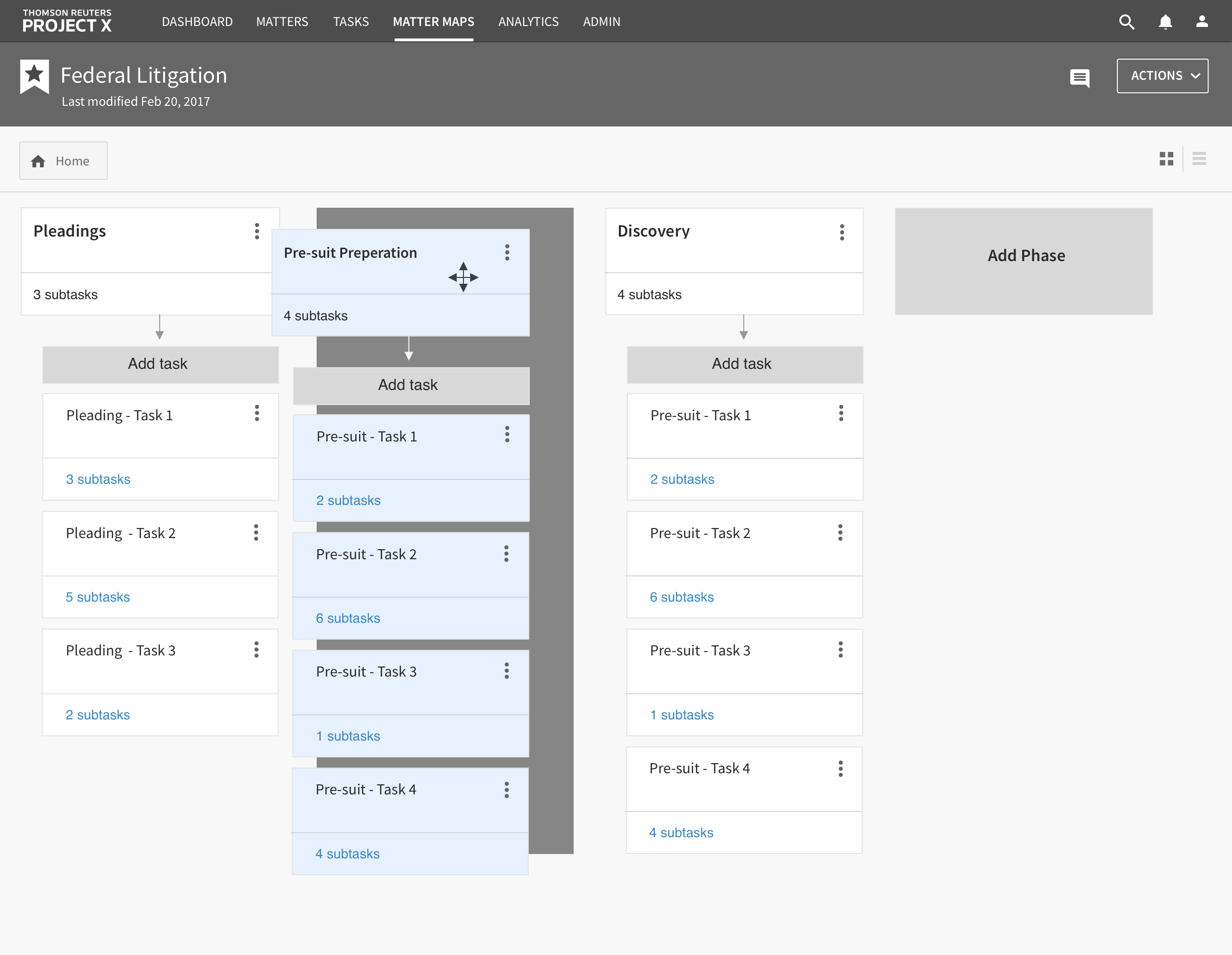
Moving the whole task:
Step 2: When the user starts to drag the whole task, a dark grey space appears in a potential target area for the user to drop the task.
In this screeshot, the dark grey space is shown between “Pleading” and “Discovery.”
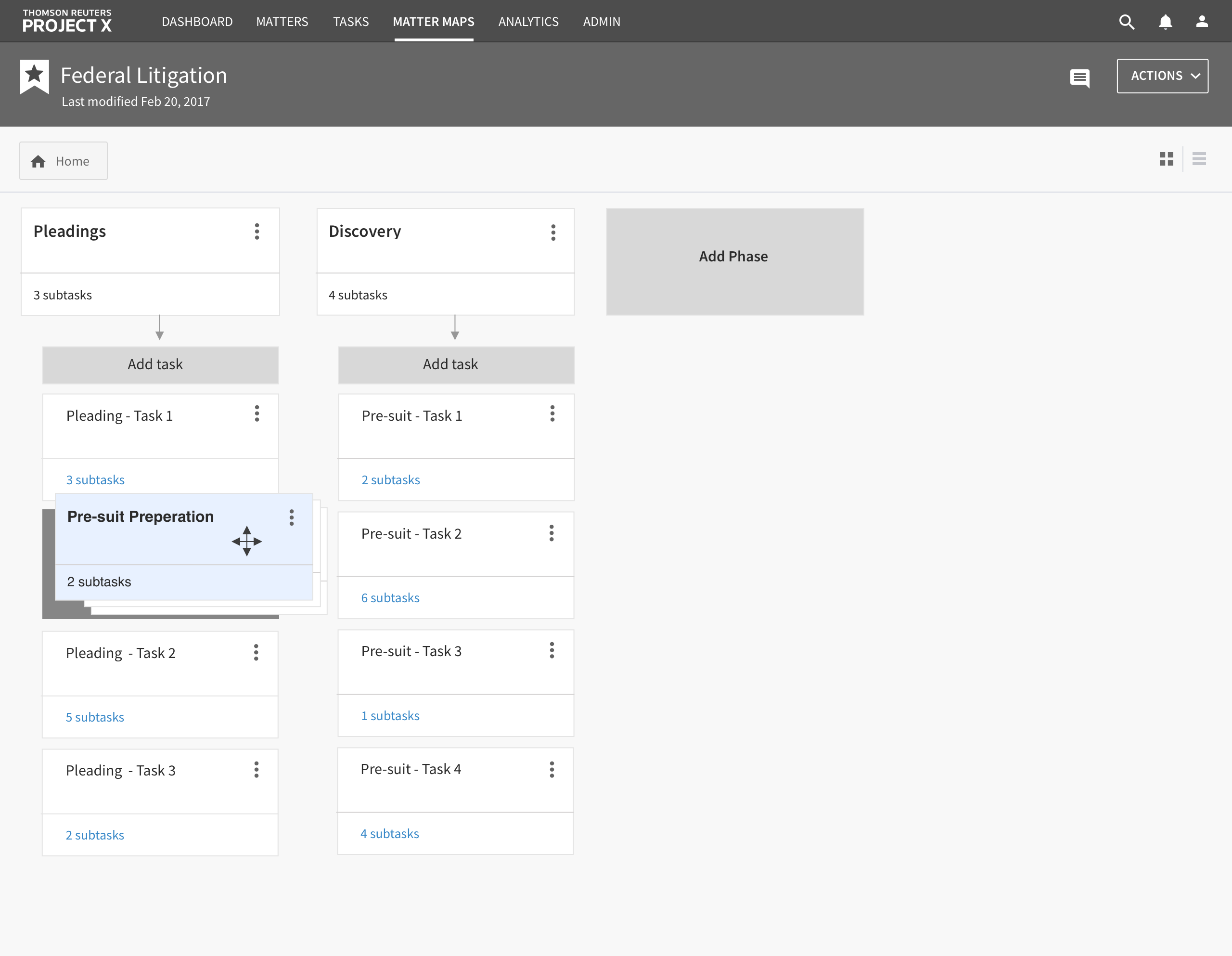
Recategorizing a task into a subtask:
Step 1: If the user wants to convert an entire task into a subtask in another column, the whole task collapses and a dark grey box appears where they can drop it.
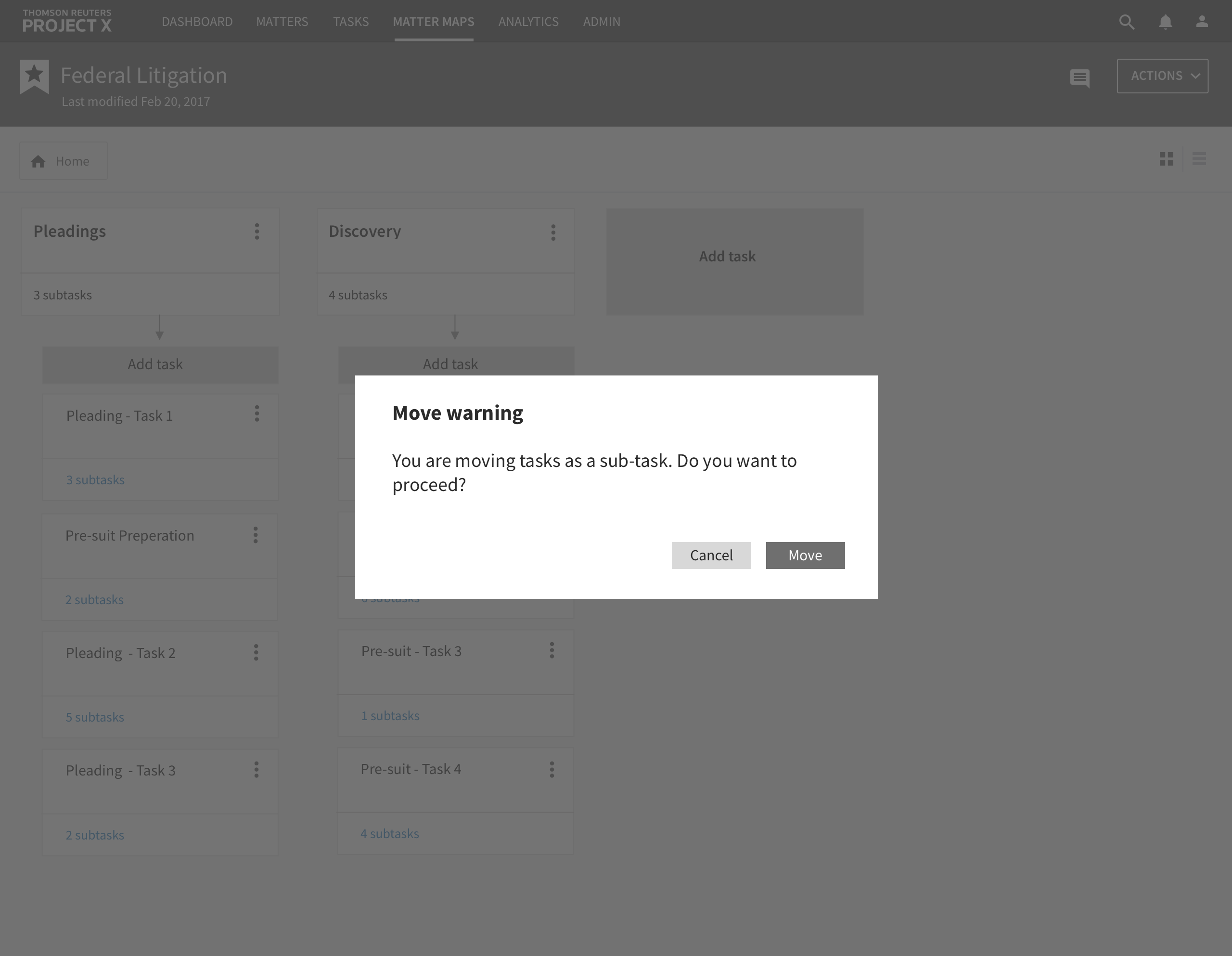
Recategorizing a task into a subtask:
Step 2: If a user tries to recategorize a whole task, they get a warning prompt.
Task 2 - Choosing a template and customizing it.
Customizing a Matter Map to fit the specifics of a case is the primary purpose of that part of the application.
We used this prototype in our user testing session to get initial feedback and determine whether or not the whole process makes sense.
User Interface Design
Matter Maps
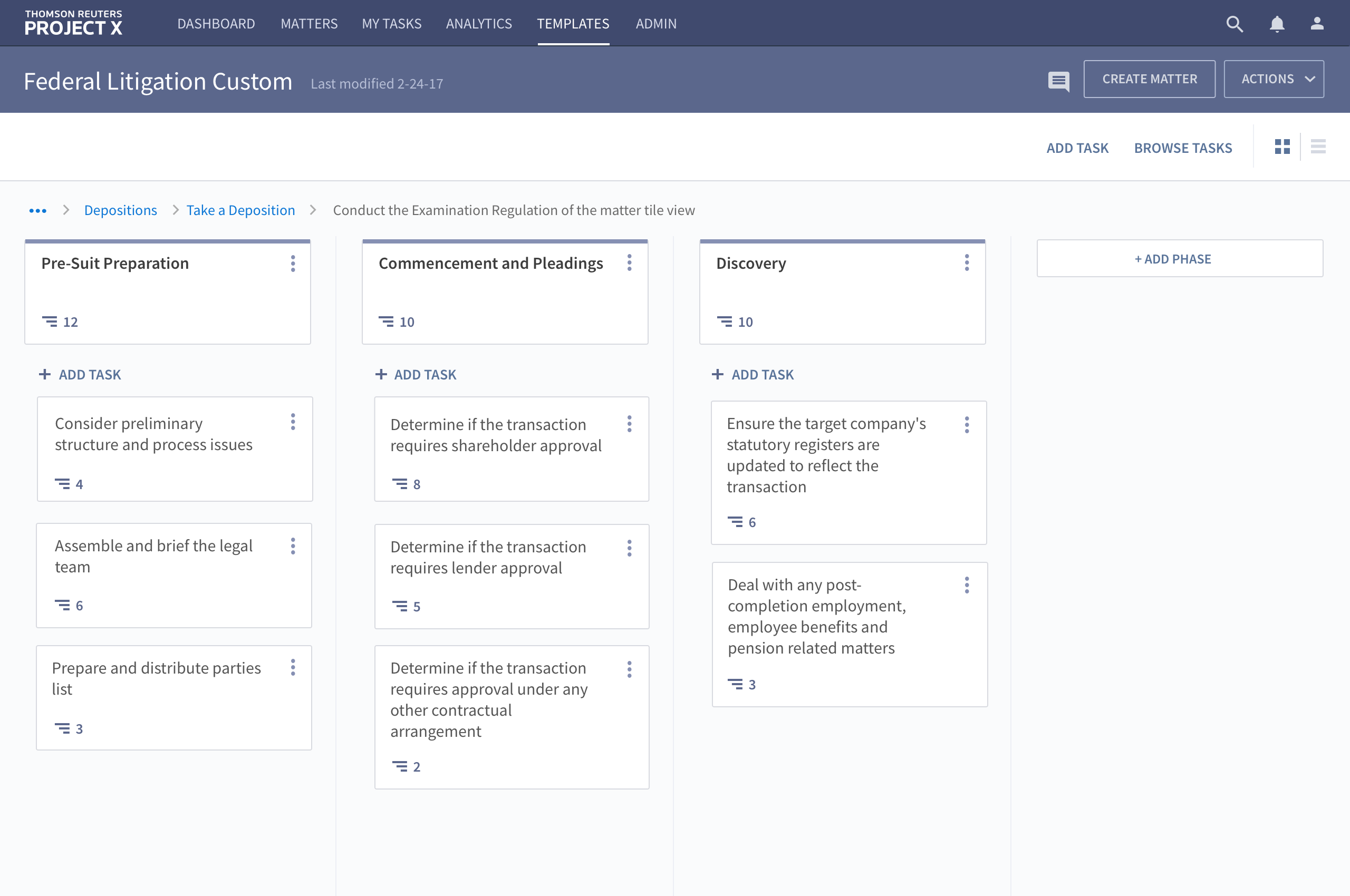
Once wireframes were finalized, I created a design mockup based on the pattern library.
Matters
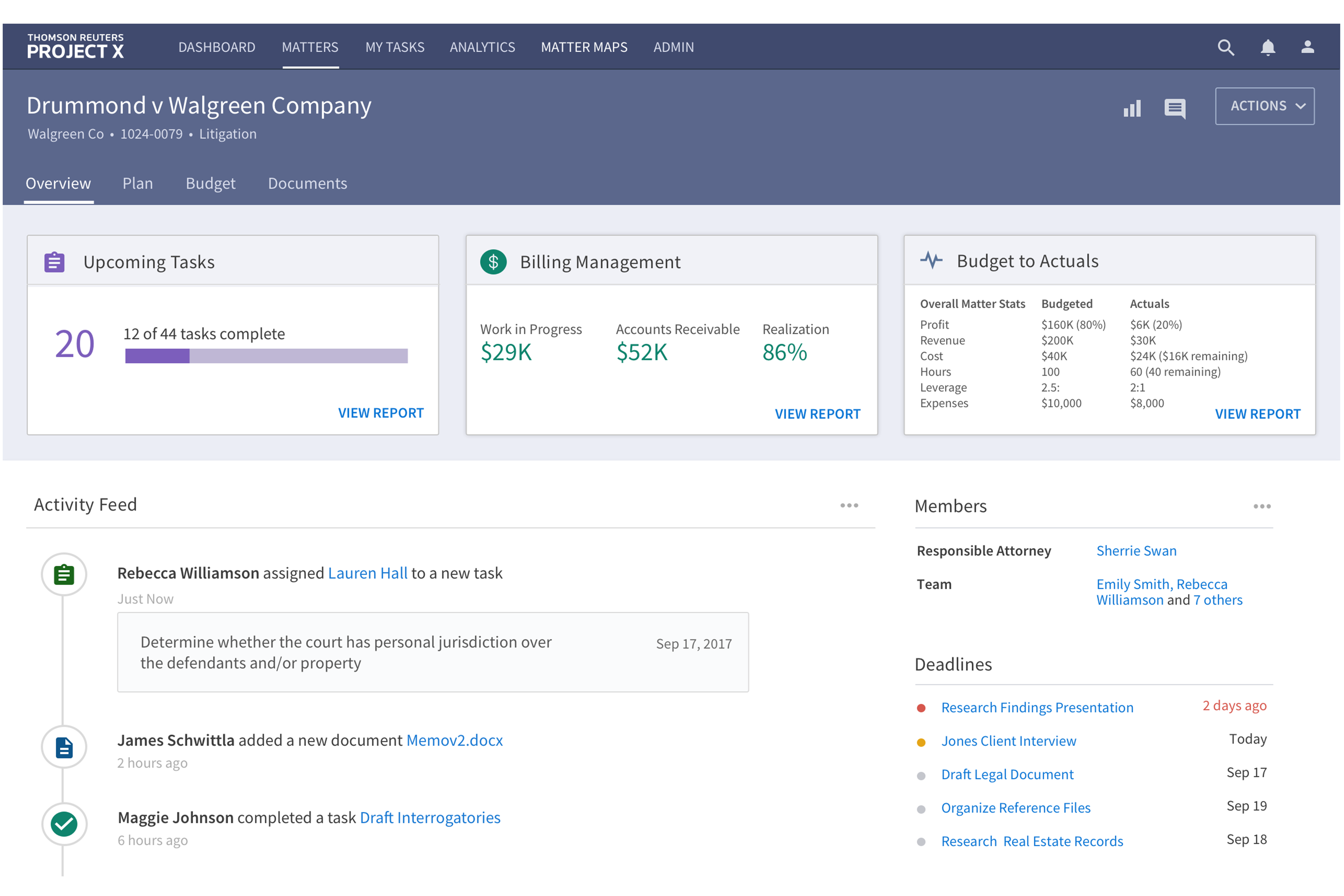
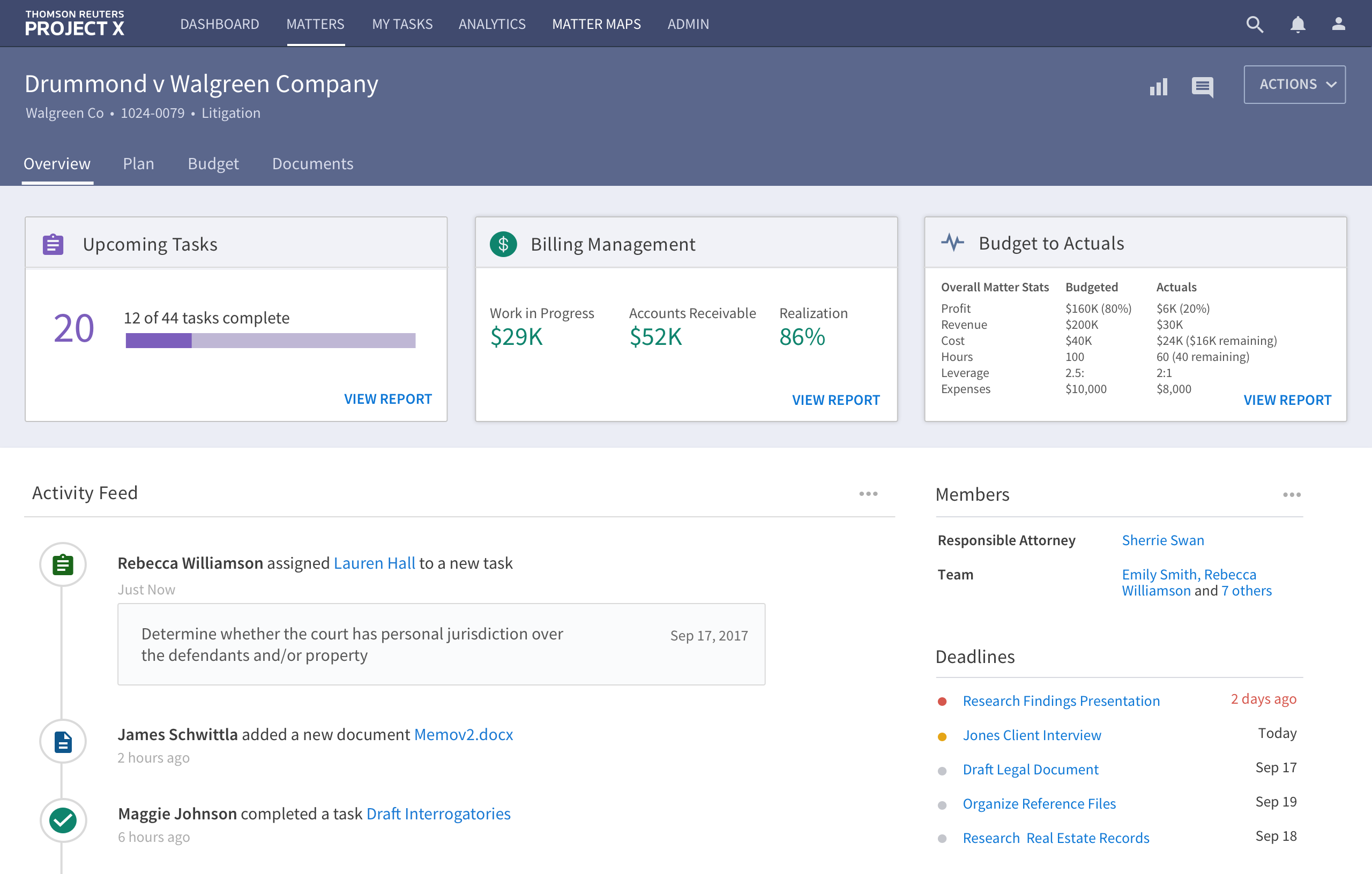
Matters is another part of the application which syncs with Matter Maps. Users can plan and estimate the cost of their legal proceedings based on the phases and tasks that were created in Matter Maps. I created a design mockup of an Overview page where users could get a glimpse about the upcoming tasks, billing management, activity feed, deadlines, and so forth.
Pattern Library
During the wireframing and design mockup phase, I actively contributed to the Panoramic pattern library. This document served as a communication tool for conveying the visual design aspects of the product to our UI/UX and development teams. Here are some of my notable contributions:
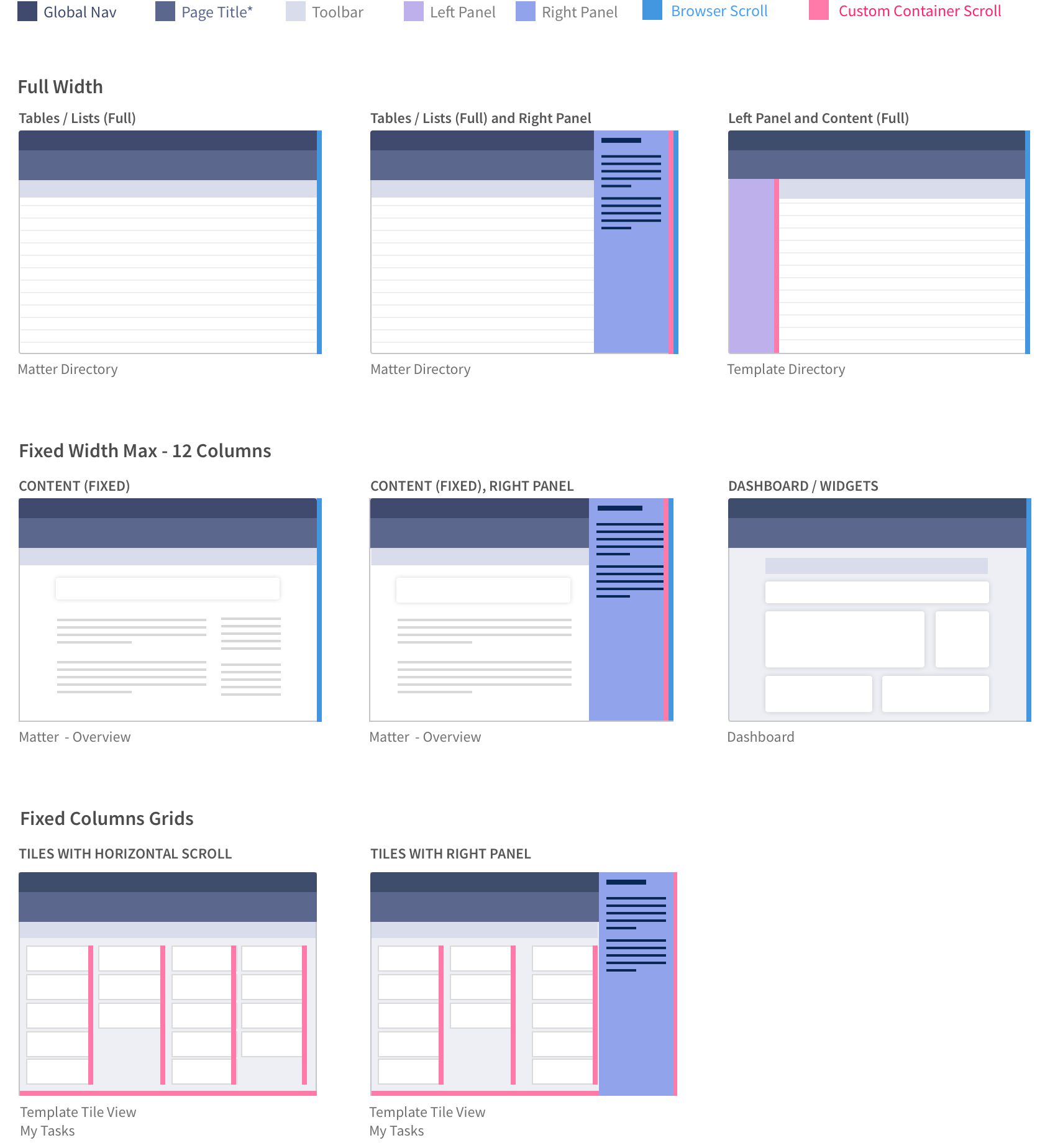
Page Layouts
I worked with the page layouts and mapped out all type of interactions that could happen on the given pages. These were based on Matters and Matter Maps part of the project.
Responsive Guidelines
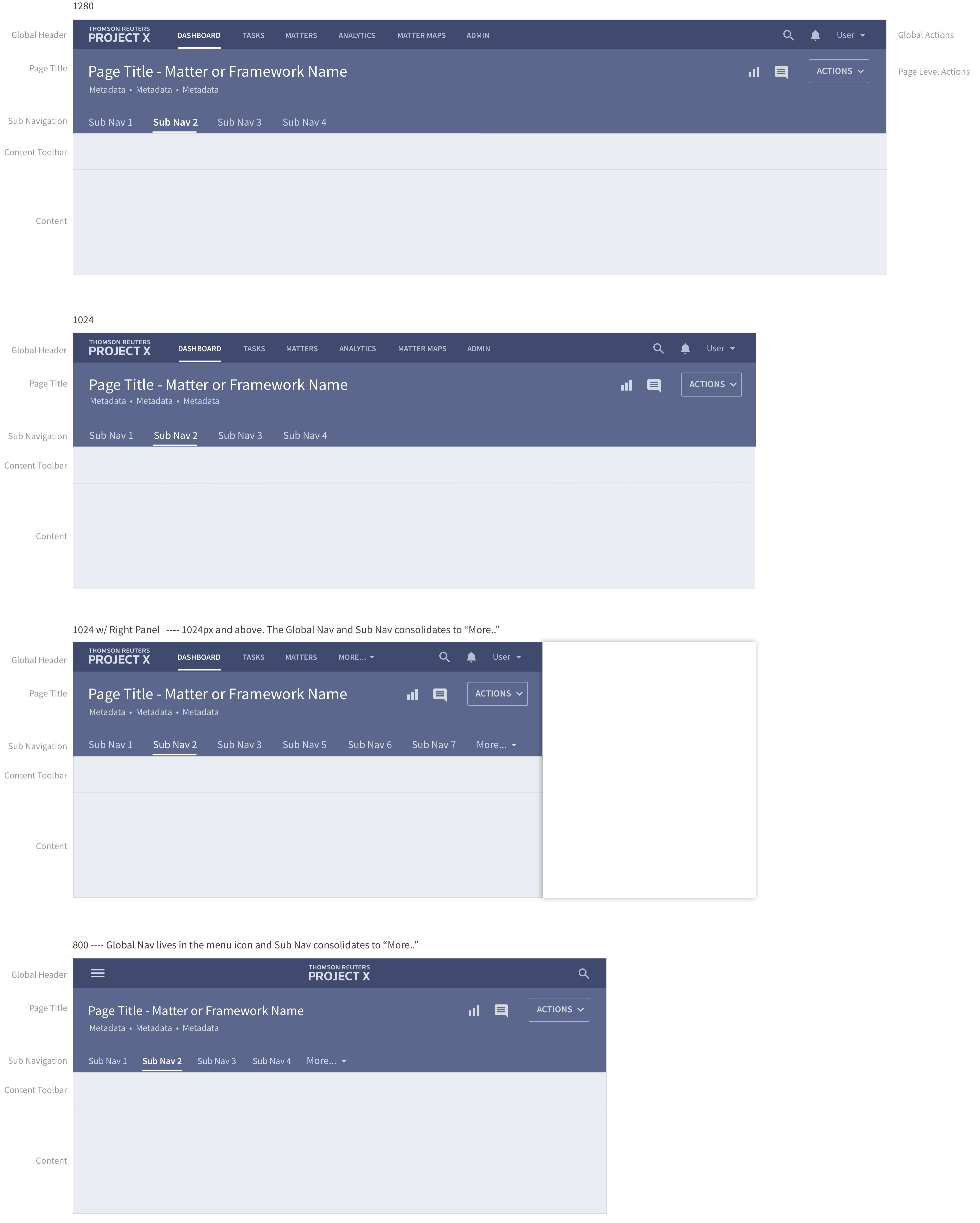
I also contributed towards clarifying all the different break points of the screens and how they would affect the navigation system.
Upload, Drag and Drop Design Components
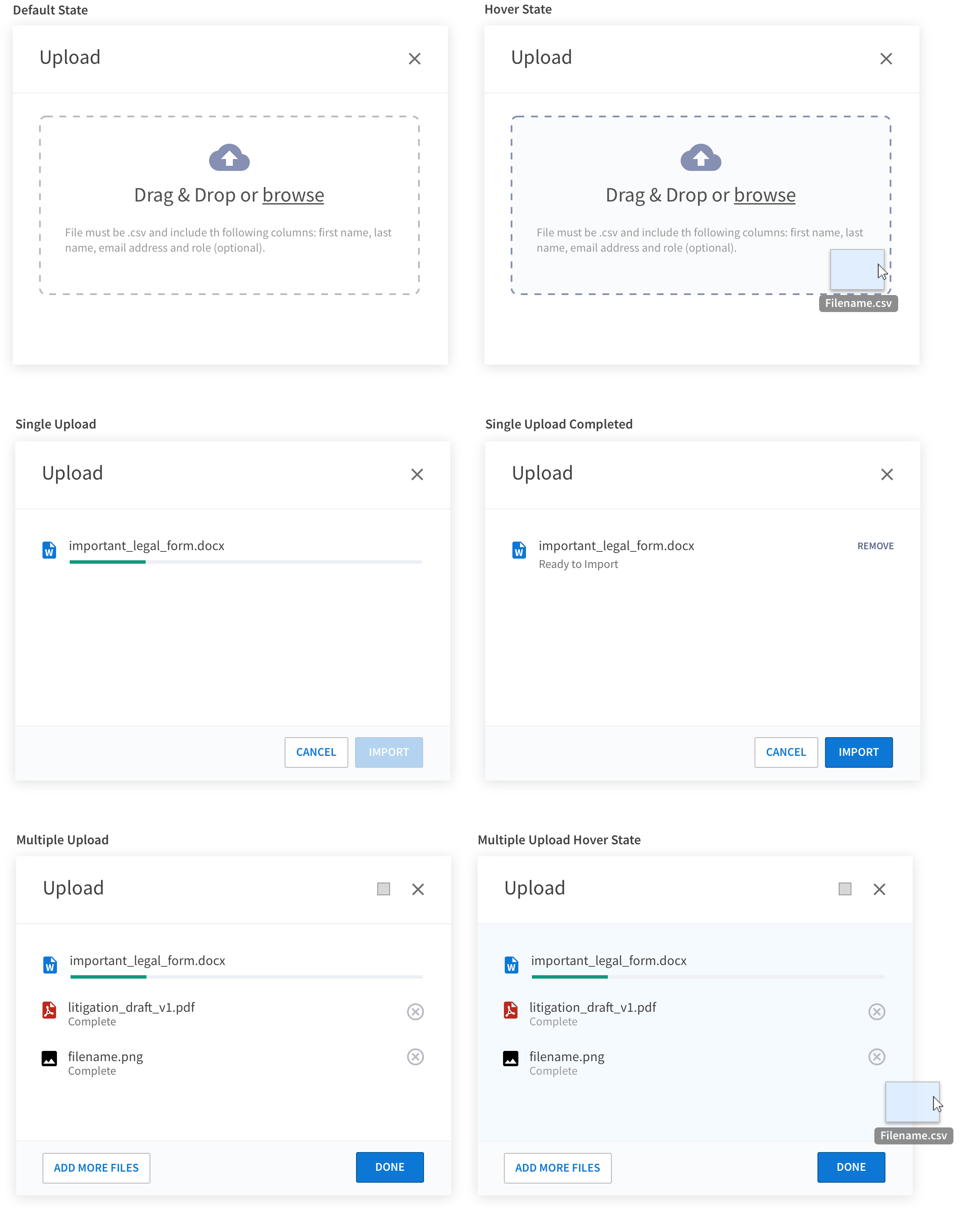
This was one of the main components as the users will be uploading lots of legal documents while working on their cases. I designed the look and feel of the pop-up component and all its states including drag and drop, hover state, single upload and multiple uploads.
Key Learning
For the first time, we conducted user testing to gather initial feedback from users. Our goal was to assess whether they could successfully complete their primary tasks and identify any critical steps we might have overlooked. The testing spanned four weeks and involved twenty participants. Here are the key insights we gained:
- Use real content: Because our prototypes were not 1:1 when it came to content and information architecture, our participants had a hard time focusing on the user journey because they were more concerned about budget thresholds and relevant task names.
-
Always test prototypes with real users: When we did our first round of testing, our users were first-year law students. During the testing, we realized that students were not reading the content, but rather clicking without completely understanding what tasks they had to achieve. This left us unsure of where there could be problems.
Our second round of testing was with lawyers who actively engaged with the content and knew how to achieve their desired tasks. This gave our team a lot of useful, focused feedback about whether or not we had too much content on the given mockup or if the workflow was too confusing, which we then used to revise the designs.
Optimized a responsive web app
Led a team of 10 members. Streamlined user flows and overhauled navigation, achieving a 42% increase in task completion rate.
