HealthPartners is a unique organization offering insurance and healthcare services. Its financial system supports over 1.8 million insurance members, while its care system is comprised of more than 1,800 physicians serving over 1.2 million patients.
- HealthPartners faced a 25% drop in user engagement, hindering overall business growth.
- Pitch a redesign of HealthPartners' authenticated and public portals and receive funding from executives.
- Tackling complex & ambiguous problems that don’t really have a defined or clear roadmap.
- Managing conflicting priorities across cross-functional departments with diverse goals, ensuring alignment, while addressing competing needs effectively.
- Tools: Sketch, Figma, Axure
- Timeline: 10 months
- Role: Product Designer
- Team: 4 designers, 2 researchers, 1 content strategist, 2 developers, 1 accessibility lead, 3 executives, 1 director, 2 product owners, 1 business analyst, 3 marketing team members, 4 customer care representatives.
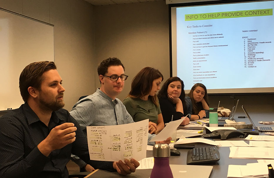
Led and collaborated with cross-functional teams to enhance HealthPartners' user experience. This project allowed me to explore the role of a product designer and understand the complexities of a large-scale project as I extended myself into other areas beyond my design role.
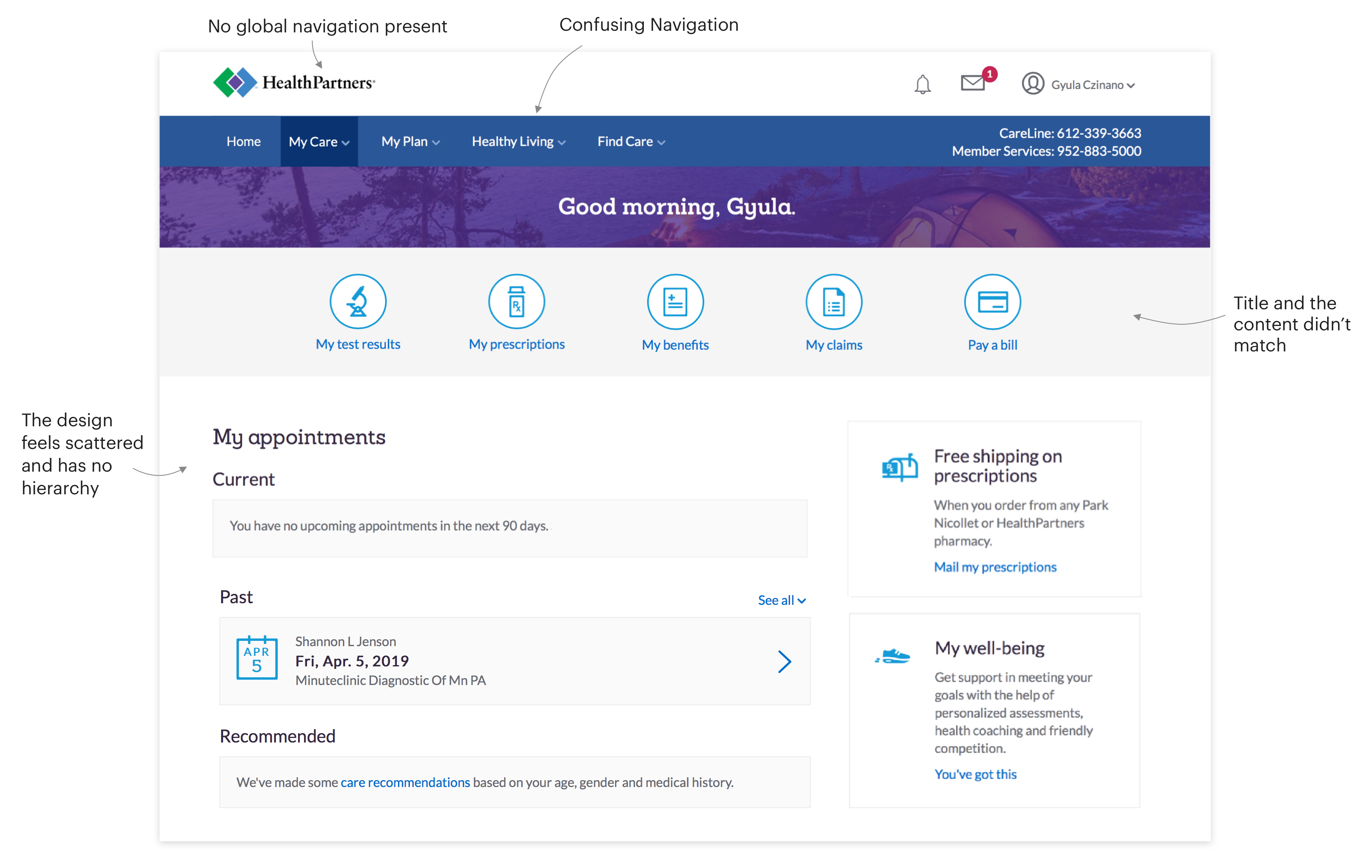
UX Audit and Insights
We collaborated with researchers and conducted extensive user research, interviewing 40+ users to understand their experiences and pain points while navigating our authenticated platform.
- Usability studies revealed 35% of clicks were misdirected, as users frequently click on incorrect links due to confusing terminology.
- Users experienced frustration transitioning from the public to the authenticated platform due to inconsistent navigation, design and layouts.
- Conversion rates for key tasks (e.g. making appointments, paying bills, changing their healthplans, etc.) was 18% below target, impacting business outcomes.
- Customer care hotline received increasing calls as a result of users abandoning tasks midway due to unclear pathways.
Business Goals and Objectives
Given the project’s high priority and strategic significance, we aimed to engage stakeholders early in the design phase. Our primary goal was to ensure alignment between business objectives and user goals, ultimately creating a valuable product for both the company and its users.
- Highlight services offered, such as Virtuwell, health programs, etc.
- Present information in a hierarchy that reflects user needs and site goals.
- Use everyday language (not jargon).
- Maintain better continuity between public and authenticated sites.
- Help consumers understand claims.
- Clarify plan coverage.
- Highlight plan benefits.
- Make it easier for users to figure out and anticipate costs.
- Provide a clear path to review recent care activity.
- Ensure that users can access all doctor profiles and easily make new appointments online to aid patient retention.
Target Audience
Members/Patients
This is the HealthPartners “sweet spot” and an opportunity to offer a differentiated experience for members who also see providers within the HealthPartners care group.
Members
This group includes current insurance plan members and their families. They are the largest audience with the highest number of active web accounts.
Patients
This group includes current patients and their families. Patients are the most active group as they have new activity appearing frequently on their authenticated sites.
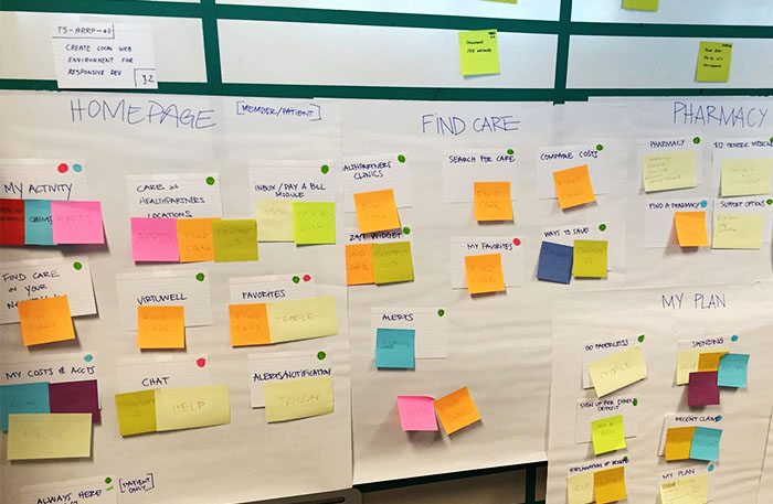
Information Architecture
We decided to go back to the drawing board and started working on the navigation based on the feedback from the users. The most important goals for us to achieve were:
- User-Centric Approach: Based on the user feedback, we wanted put ourselves in users' shoes and understand the goals, needs and preferences of members and patients.
- Clear Labels: We wanted to ensure that primary and secondary navigation labels were concise, descriptive, and easy to understand. We avoided jargon or ambiguous terms as that had been one of the main painpoints for the old experience.
- Logical Grouping: We wanted to organize and group items logically based on function or relevance.
- Prioritization: We wanted to prioritize essential features that members and patients accessed most frequently, and keep those above the scroll line so they would be easily accessible.

Wireframes - Navigation Re-Design
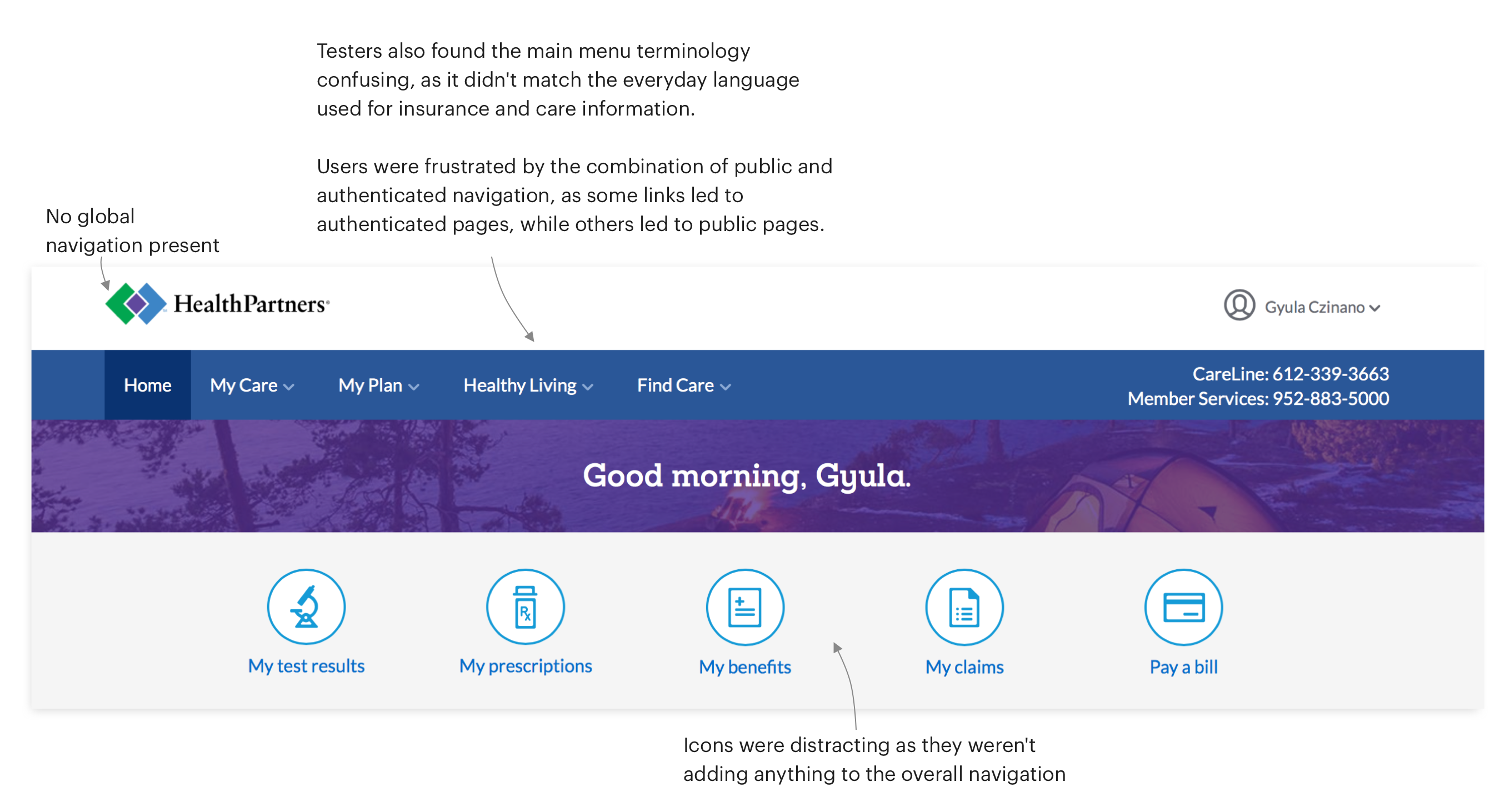
Previous Navigation
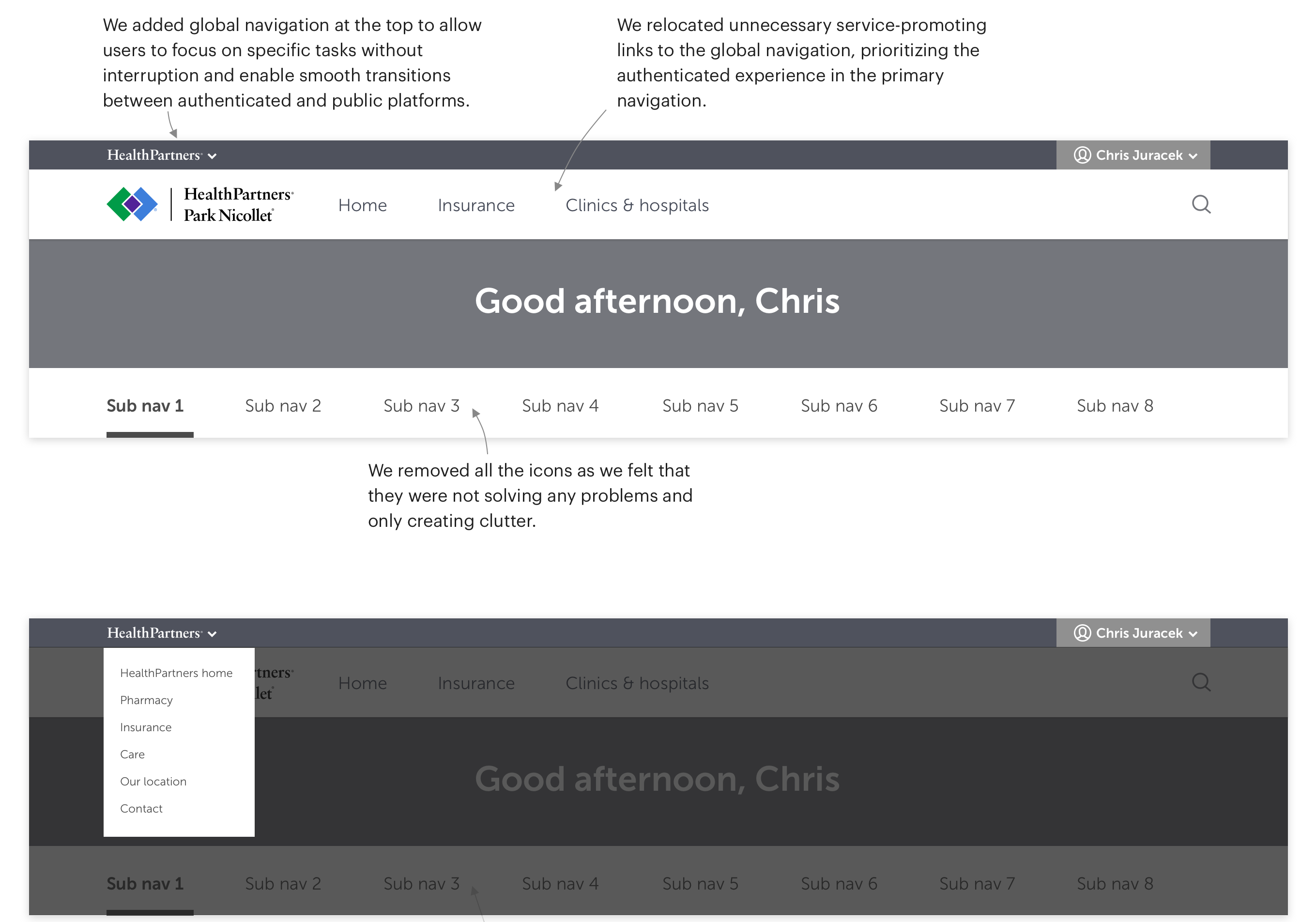
New Navigation
Wireframes - Authenticated Platform
Given the scale of the project, there were several designers on the team. For the design itself, we aimed for consistency with the overall look of "Insurance" and "Clinic & Hospital" sections.
My focus was on some specific pages and features that are presented below.
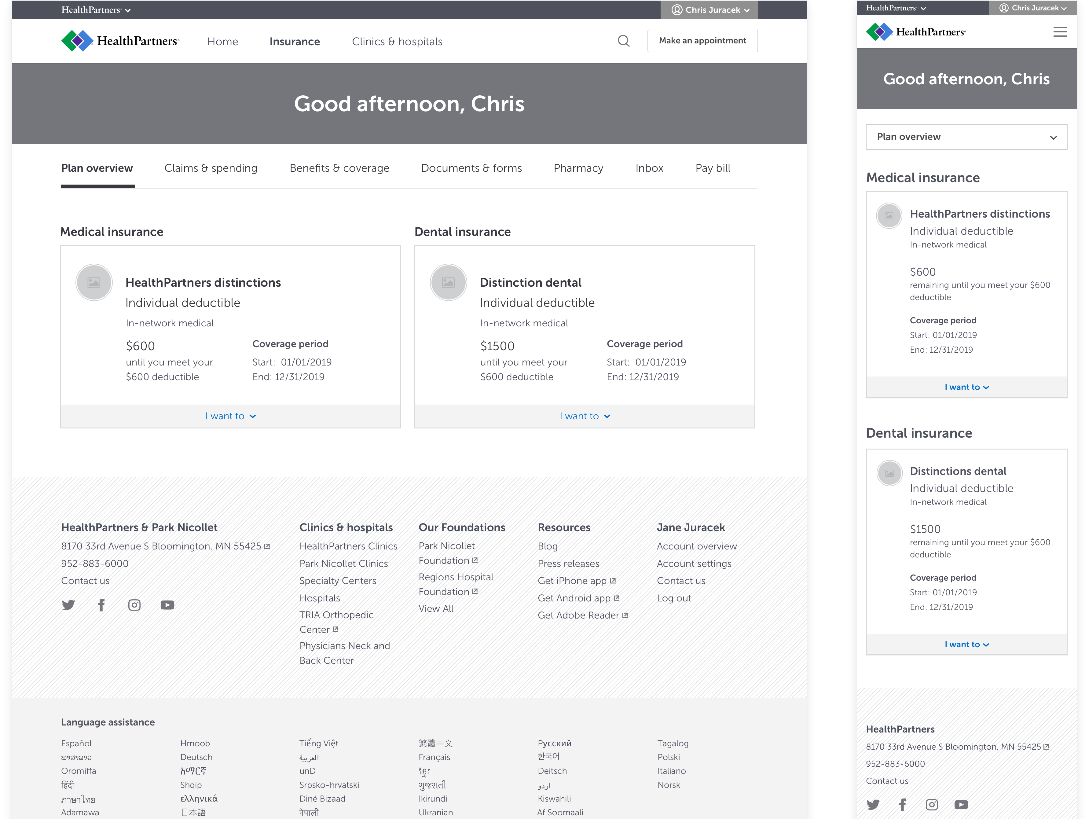
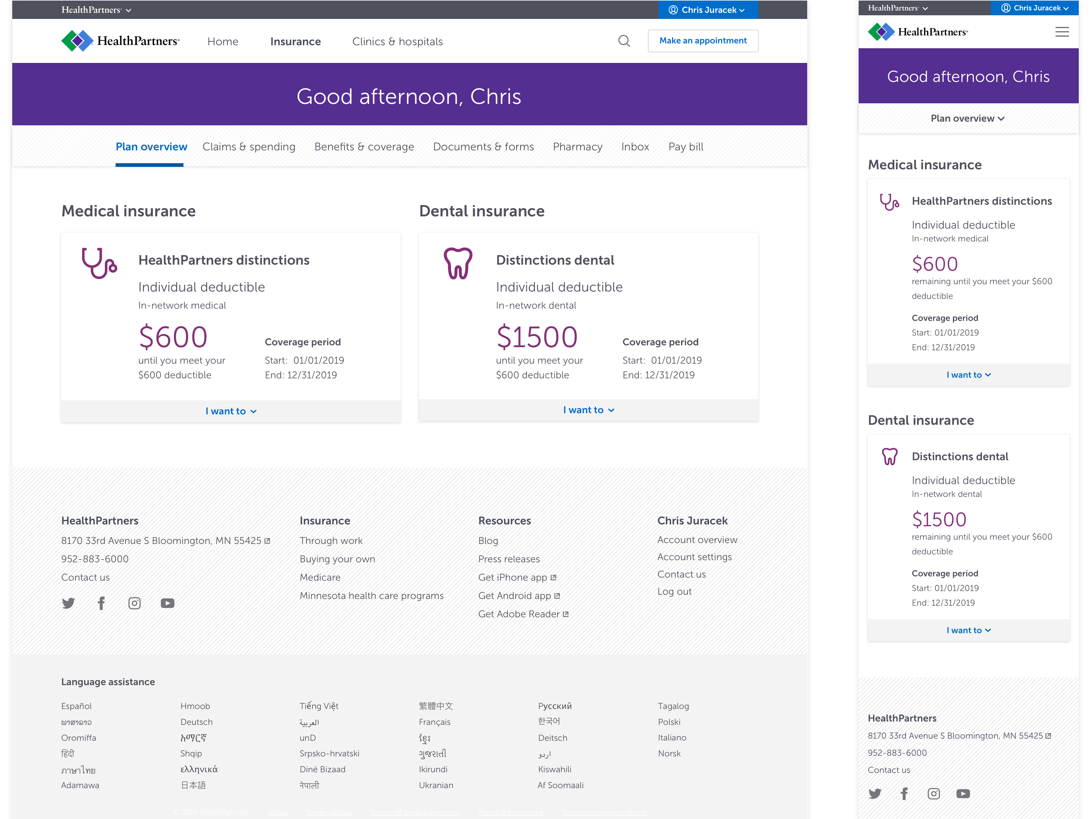
Insurance
Problem:
"My Plan" terminology confused users as it didn't clearly relate to insurance. Additionally, the cluttered design and lack of hierarchy made accessing key insurance details difficult.
Solution
"My Plan" was renamed to "Insurance" to minimize unnecessary confusion.
The new card-based design presents complex information clearly, streamlines the "Plan Overview" page and makes insurance details more accessible, allowing users to quickly scan and act. The "I want to" dropdown on each card enhances usability by enabling direct actions and improving navigation.
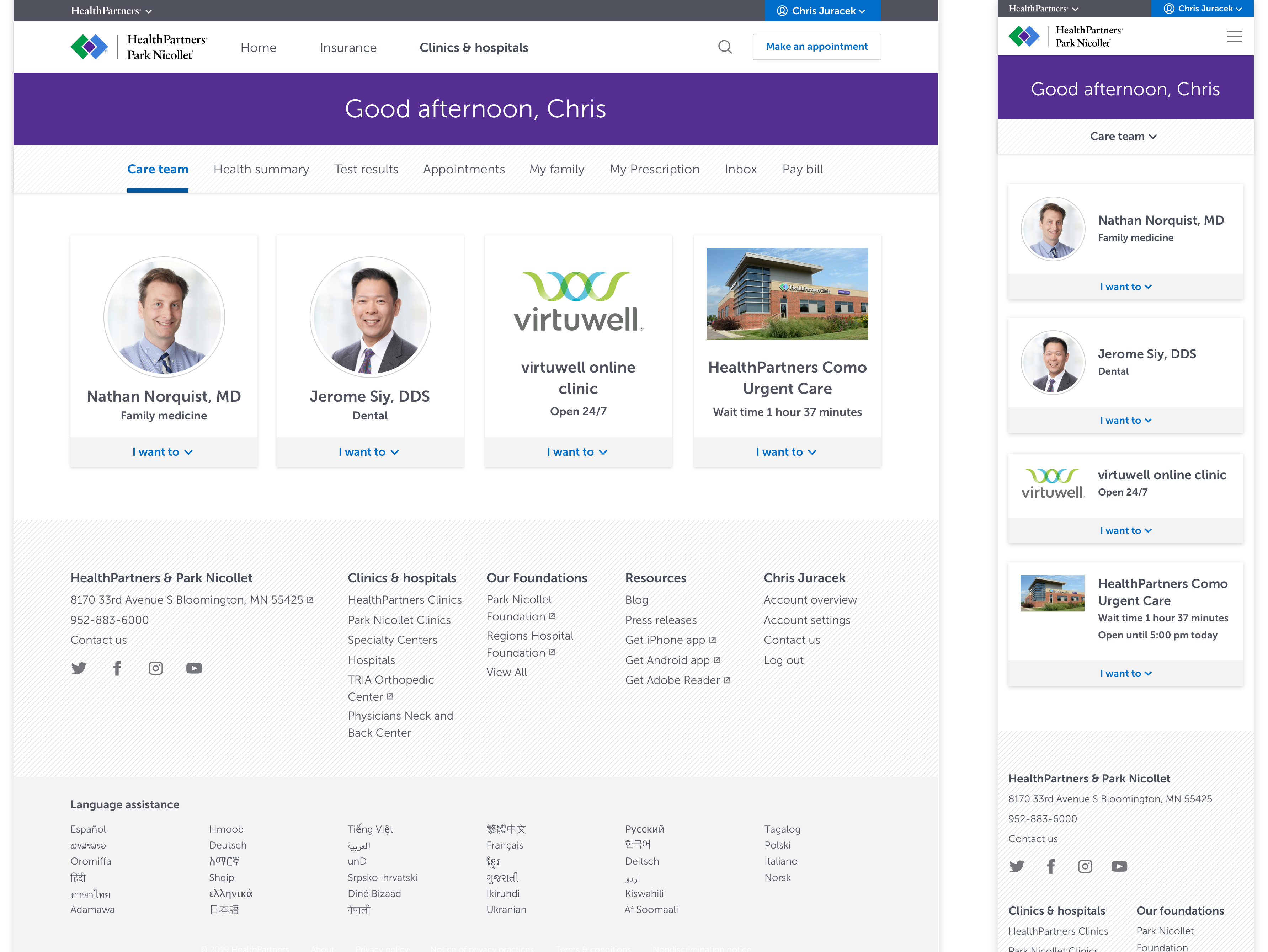
Clinics and hospitals
Problem:
"My Care" terminology was confusing as users didn't expect it to contain information about their appointments. They also struggled to find and connect with their current providers as it was buried deep in the navigation.
Solution
The "My Care" section was renamed "Clinics & Hospitals" for clarity.
On the "Care Team" page, users now have easy access to their primary providers. The "I want to" navigation empowers users to make appointments, view profiles, or contact their providers, streamlining the process.
We also integrated Virtuwell, HealthPartners' popular 24/7 online clinic. Additionally, we listed the nearest in-network urgent care facilities based on location.

User interface design
Problem:
Users experienced inconsistencies in the look and feel of both platforms, which created confusion, reduced brand trust, and hindered a seamless user experience.
Solution
Help product owners understand the value of a robust design system in creating consistent experiences across platforms, streamlining development processes, enhancing scalability, and delivering a unified user experience.
Insurance
Clinics and hospitals
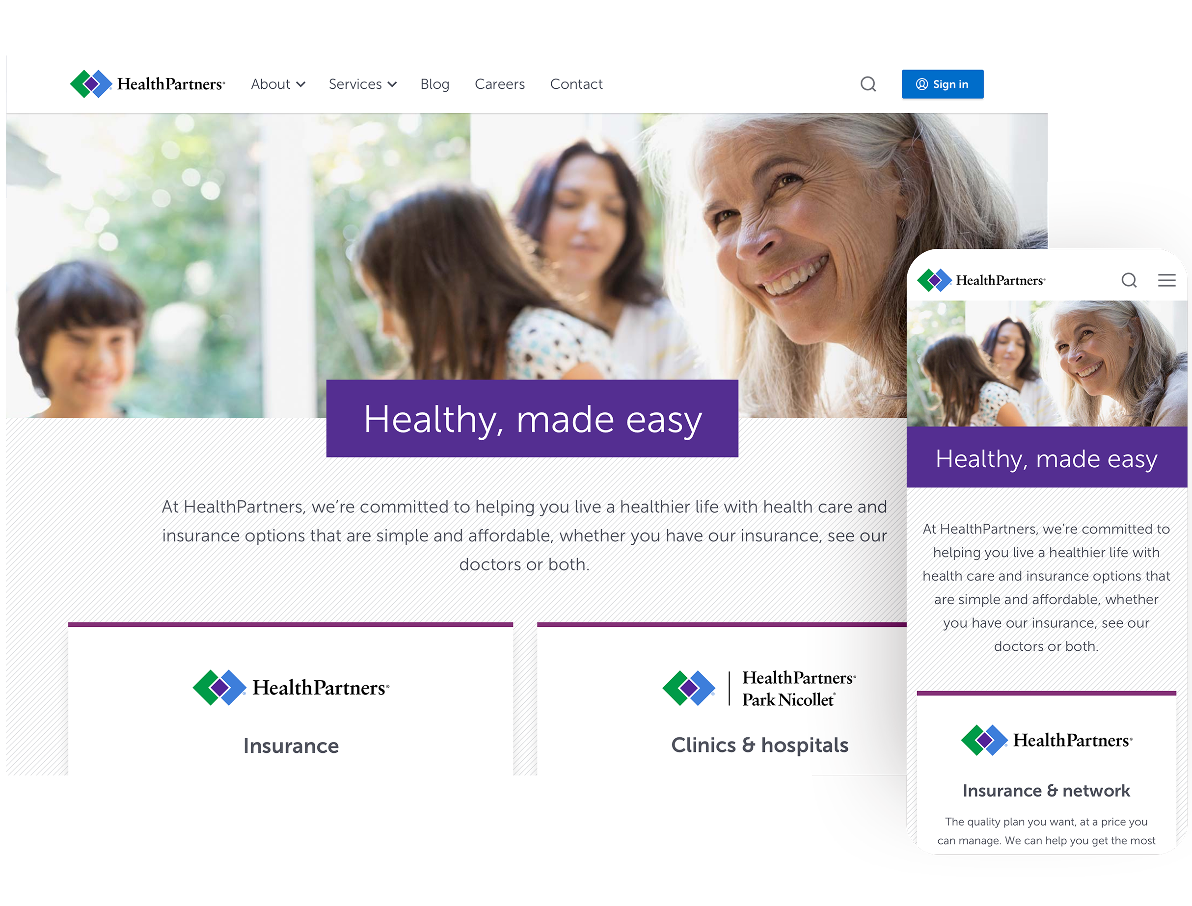
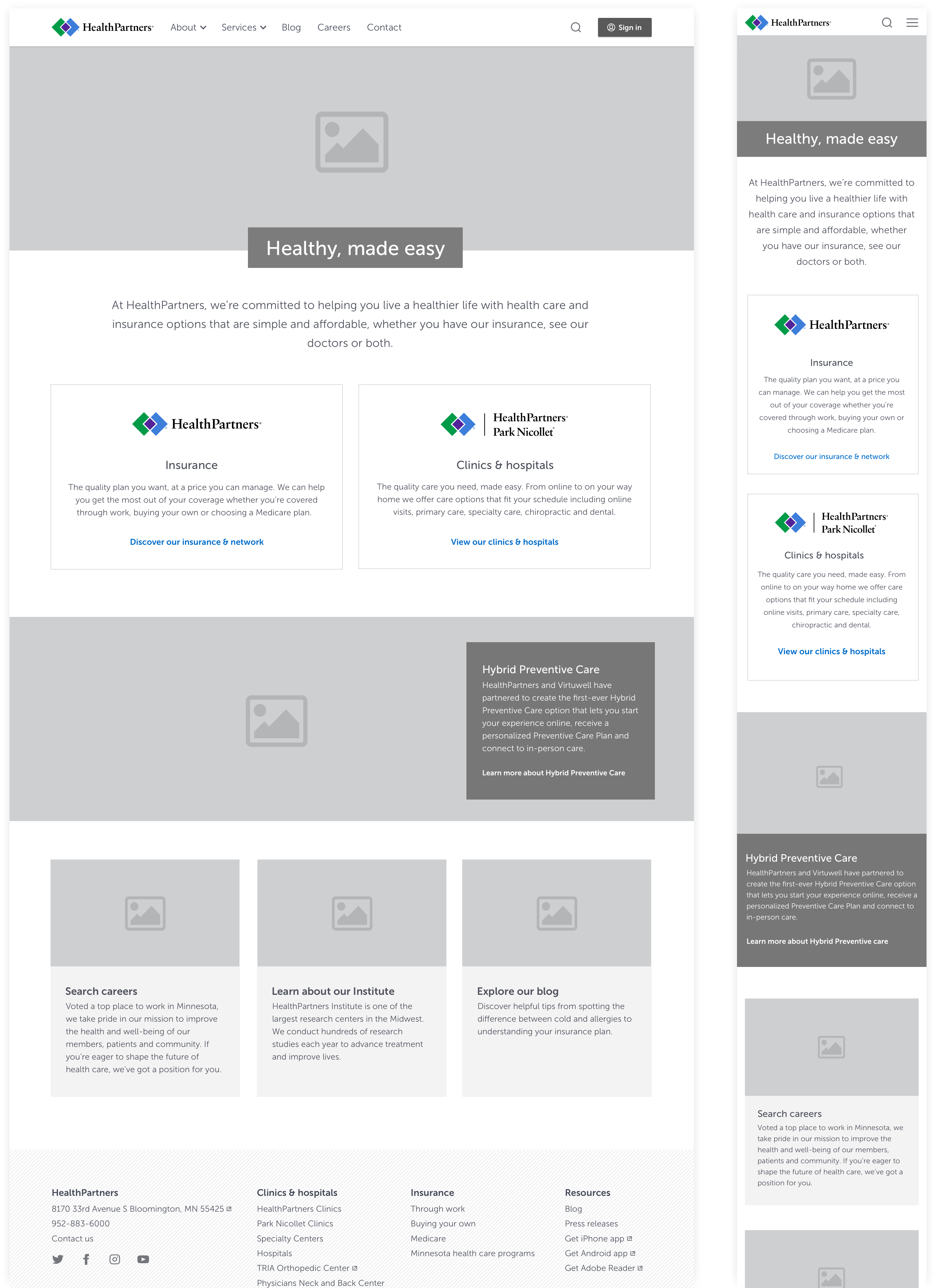
Wireframes (Public Homepage)
While work was still ongoing on the authenticated platform, I shifted my attention to the public platform.
Problem:
Users didn't realize HealthPartners offered both healthcare services and health plan financing and administration. These unique features needed to be highlighted both separately and more clearly.
Solution
Two dedicated sections for "Insurance" and "Clinics & Hospitals" were added above the scroll line so they would be easily accessible to the user. Each section includes a list of highlighted services allowing users to discover the benefits of being both a member and a patient at HealthPartners.
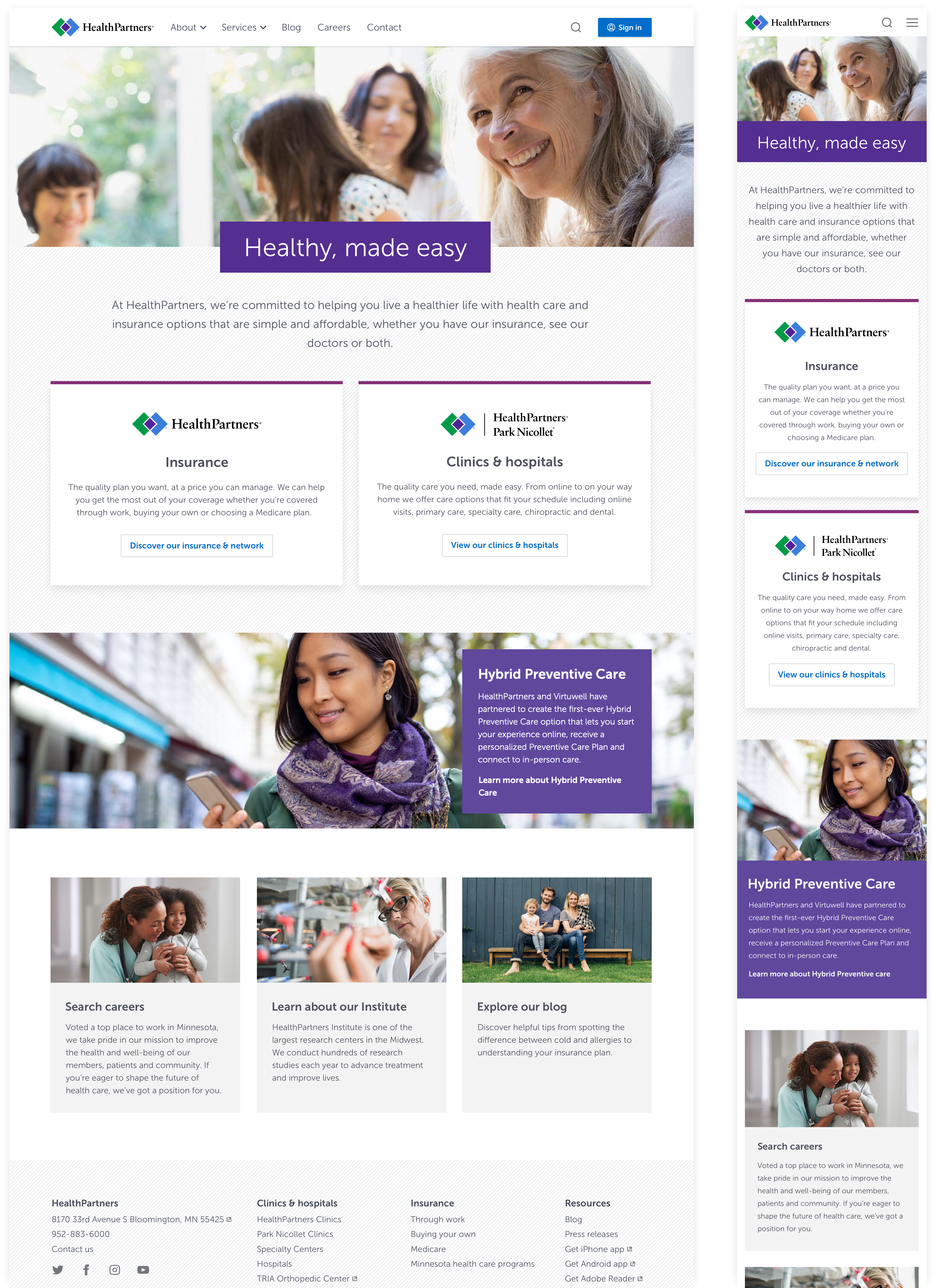
User Interface Design (Public Homepage)
Outcome and Achievements
- Prioritized features and resolved dependencies, contributing to a 25% faster delivery of key milestones while collaborating with cross-functional teams of 20+ members, including designers, developers, researchers, marketing, and sales.
- Streamlined and optimized user flows and navigation, achieving a 40% increase in task completion rate.
- Received very positive feedback on the new navigation design, including global navigation, which helped users to focus on crucial aspects of the authenticated experience rather than getting lost on unrelated pages.
Key Learning
- Communication: Communication was key when selling the redesign to executives as my team needed to explain how user experience and aesthetics can create business value.
- Research: Great designs are built on a foundation of research, ensuring they meet user needs and drive meaningful results.
- Collaboration: The success of a designer's work is deeply rooted in effective collaboration with cross-functional teams and stakeholders. Designers do not exist in a vaccum, and the quality of our work depends on how well we can collaborate.
- Ambiguity: Navigating uncertainty and ambiguity is both one of the most challenging and rewarding aspects of design and leadership. Although a lack of clarity can feel uncomfortable, it also provides an ideal space for creativity and strategic thinking to flourish.
- Personal growth: I was handed an opportunity to lead and collaborate with cross-functional teams and I wanted to make the most of it. This project allowed me to explore the role of a product designer and understand the complexities of a large-scale project as I extended myself into other areas beyond my design role.
It taught me the importance of empathy and resilience as well as the ability to align diverse goals toward a shared vision. It was a learning experience that sharpened my problem-solving and leadership skills significantly.
360 Encompass™ System Redesign
Simplified complex user journeys in an outdated interface. Implemented 10+ new features and a significantly enhanced user experience based on user testing results.