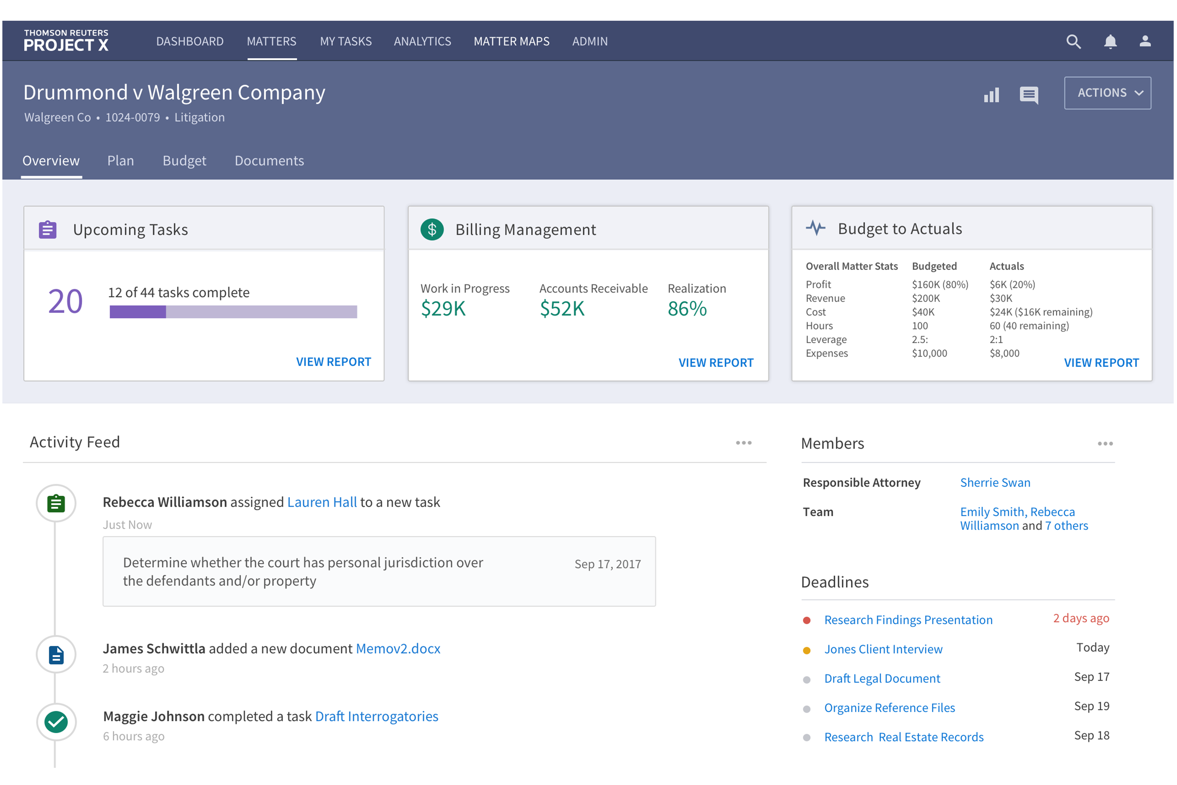
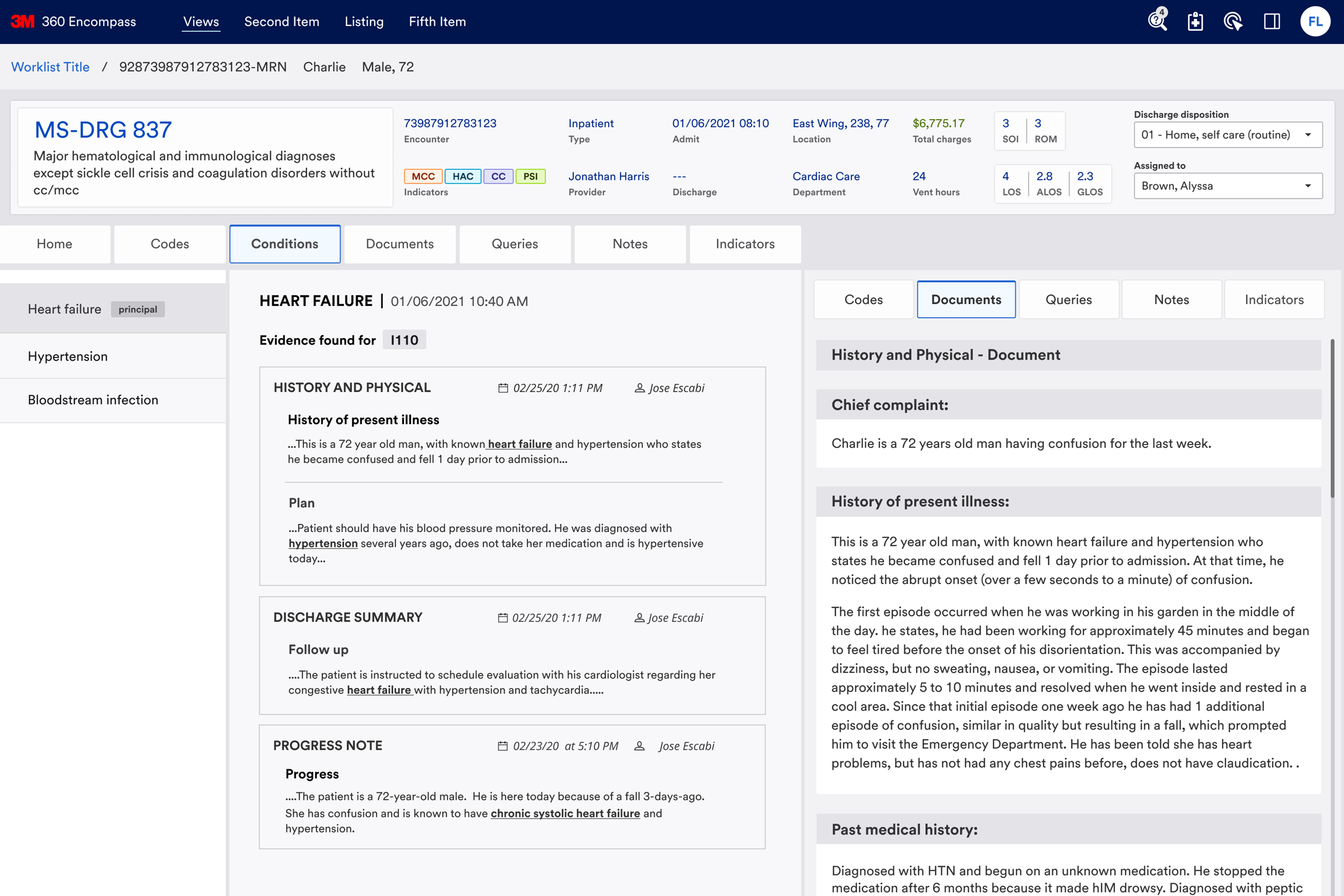
The 3M 360 Encompass System is a comprehensive platform that helps hospitals streamline processes, receive accurate reimbursement, promote compliance, and make data-informed decisions.
- Conduct interviews and testing to learn about the pain points of all the users.
- Simplify and clarify menus and navigations.
- Enable and simplify user-to-user communication through new built-in tools and functionality.
As a senior interaction designer, my role involved identifying pain points from user testing, interviewing diverse users like doctors, CDIs (Clinical Documentation Improvement Specialists), and coders, and creating journey maps to understand their communication. Our team then developed new wireframes based on these insights.
- Tools: Figma
- Timeline: 9 months
- Role: Senior interaction designer
- Team: 1 creative lead, 1 researcher, 1 senior interaction designer, and 1 visual designer
As a senior interaction designer, I quickly acclimated and made substantial improvements to a complex healthcare application. Through in-depth interviews, I identified key pain points, streamlined the user experience, and aligned the functionality with users' needs.
The 3M™ 360 Encompass™ System
3M 360 Encompass is a comprehensive platform used by thousands of hospitals and healthcare providers to achieve the following results:
- Bring together computer-assisted clinical and physician documentation with professional services coding.
- Prioritize tasks and improve workflow efficiency through greater collaboration among coders, clinical documentation improvement specialists (CDIs), and providers.
- Produce accurate, complete, and compliant data that promotes quality patient care with the help of computer-assisted coding and provider documentation.
Current Application (Backend Process Example)
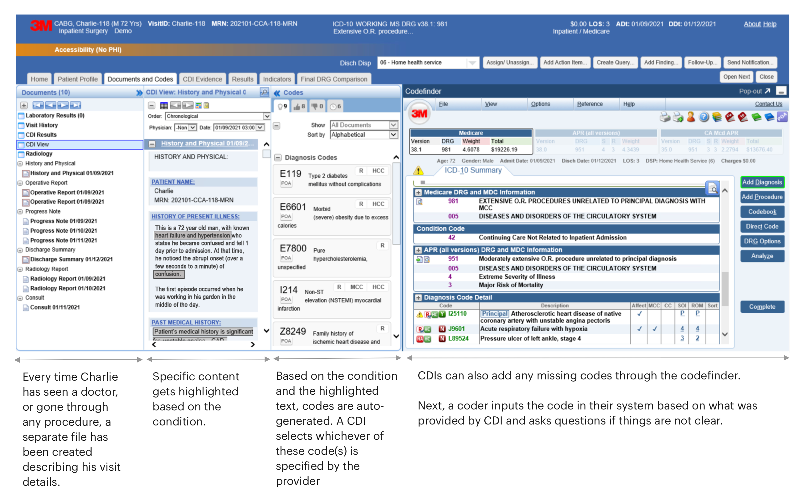
To understand how the backend process works, let's use the example of Charlie, a 72-year-old man. He has been seeing a provider, has been admitted in the past and also had scans from the Radiology department. His information appears on the Documents and Codes page as shown below.
Pain Points
Our team conducted another round of usability testing and spoke to doctors, CDIs and coders to understand their painpoints. We received the following feedback:
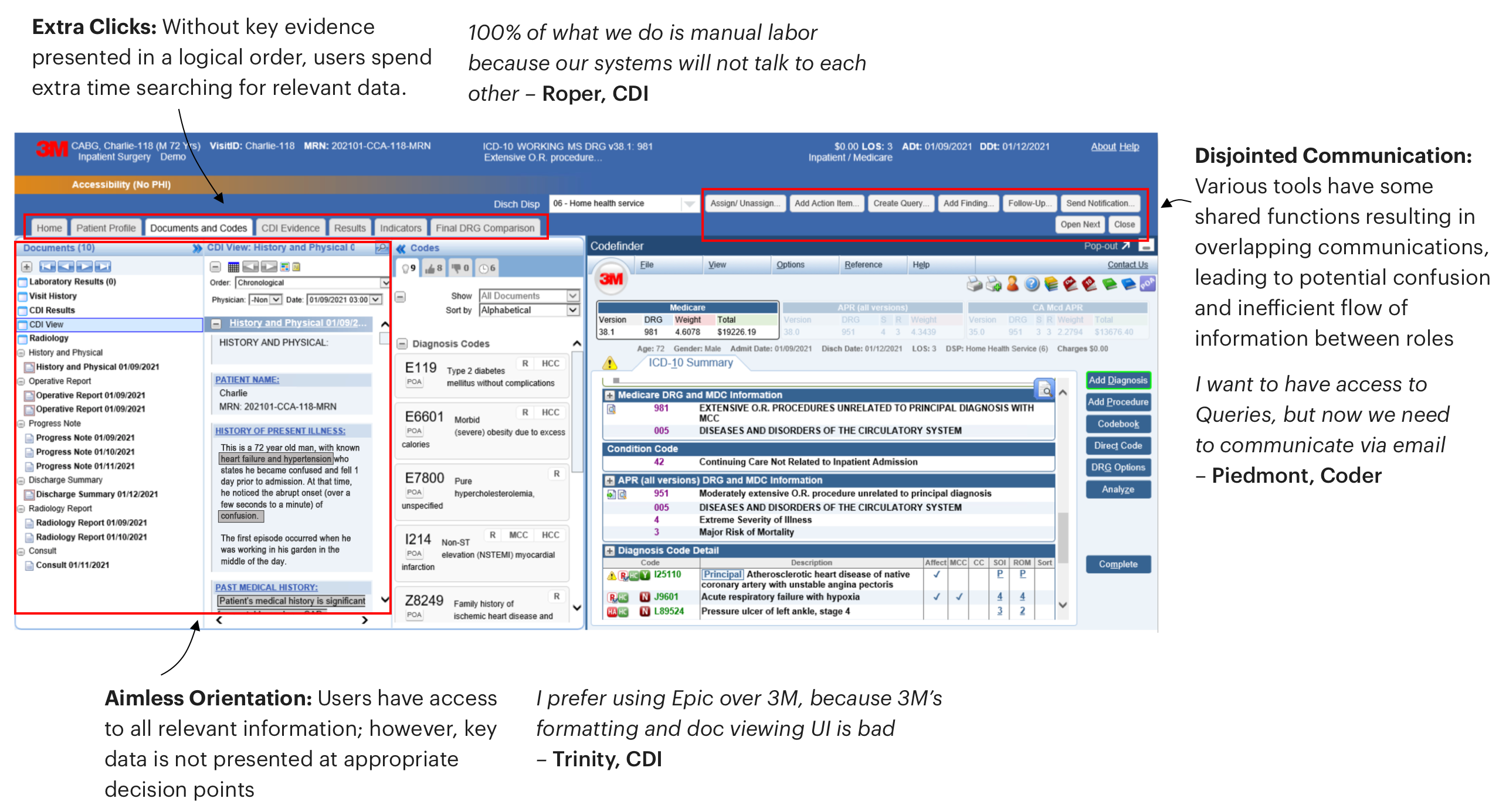
- The application structure was cluttered, with an unclear hierarchy, and the overall design appeared outdated.
- The application lagged behind competitors and failed to provide an efficient user experience.
- Many CDIs preferred using Epic, an electronic health records system, for viewing patient information.
- A significant pain point was that the coding process could only begin from the "Documents and Codes" combined view, imposing unnecessary restrictions.
- Key information was neither logically presented nor available at crucial steps, causing users to backtrack and dig through the system.
- CDIs and coders faced multiple competing touchpoints, leading to confusion and overlapping communication, which resulted in frustration.
User Journey
After identifying the application's pain points, we began redesigning the interface. We analyzed interactions between patients, doctors, CDI nurses, and coders, then mapped user journeys to understand the background processes.
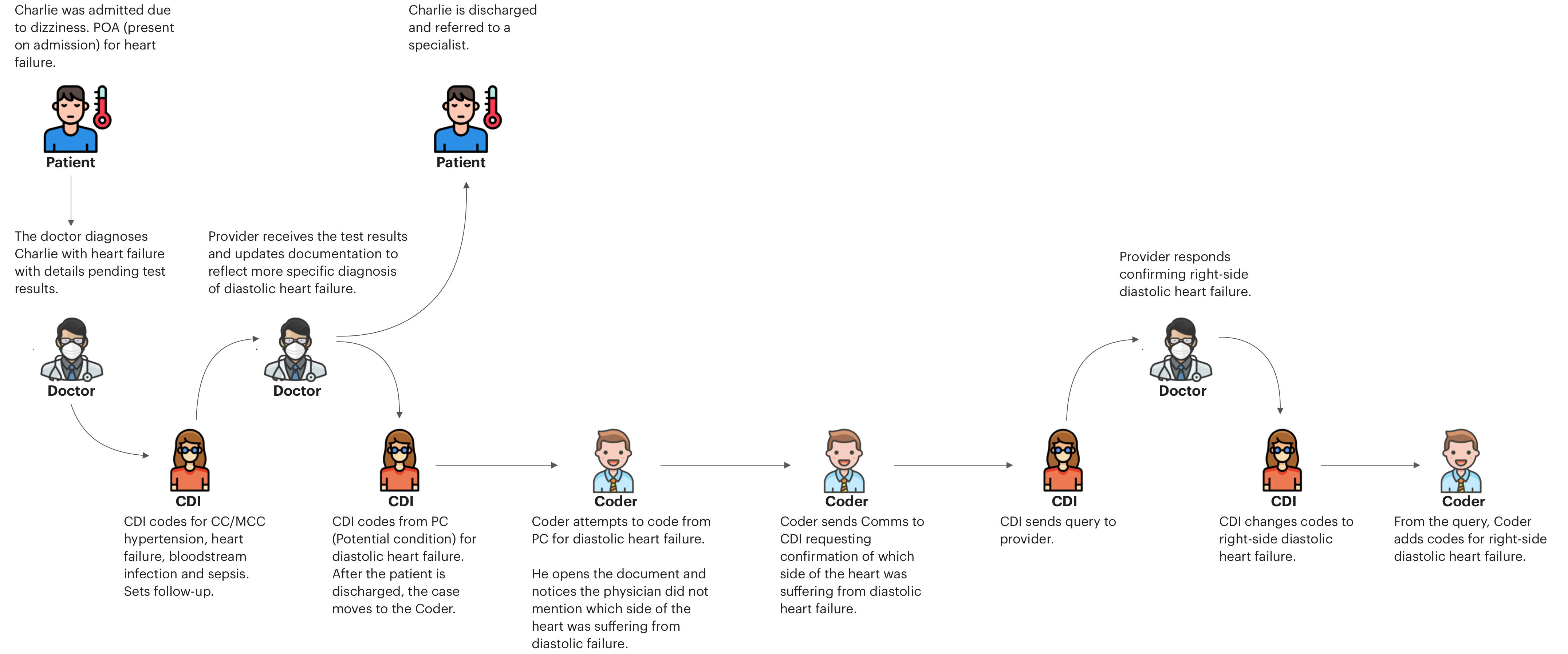
Query to find potential condition
This journey shows how query fuctionality is used by the CDI to ask for a potential condition from the provider. Let's take Charlie, our 72-year-old, as an example again.
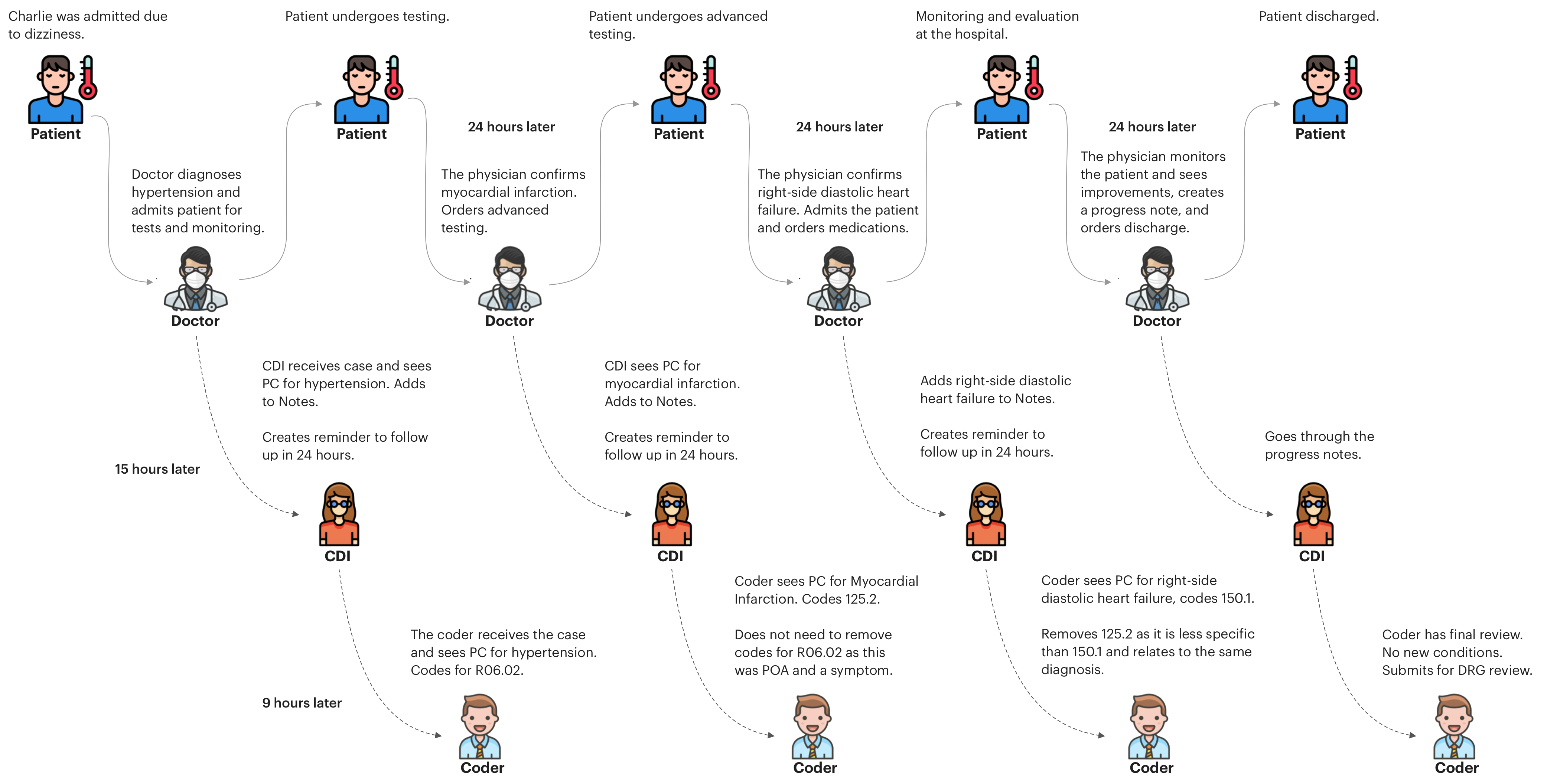
Concurrent Coding
In this example, Charlie has seen a provider once and due to his health complication must schedule multiple visits.
Wireframe (low-fidelity) - Structure Redesign
Problem:
The whole interface must be redesigned, as the past structure was actively preventing the users from achieving their main tasks efficiently.
Solution
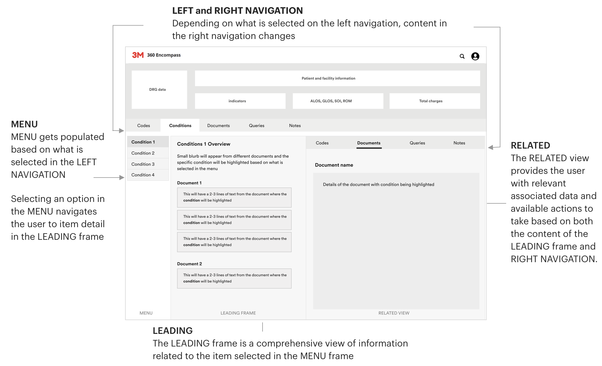
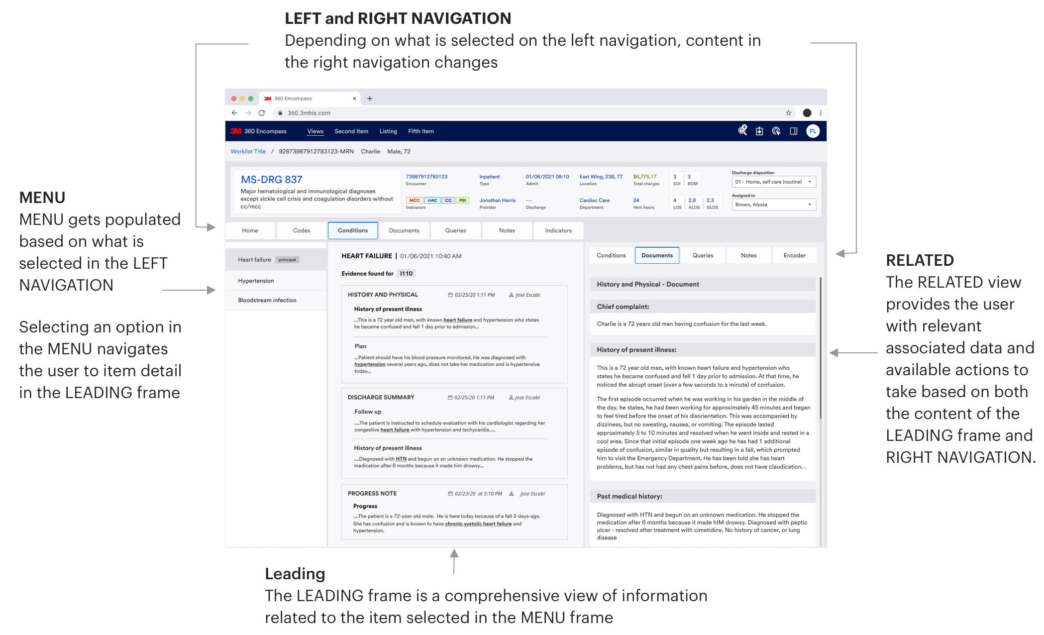
To solve this problem, we decided to use left and right navigation. Instead of users being limited to coding only from the "Document and Codes" view combined, they now can do it separately, which let users pick their starting points. We also added Conditions, Queries and Notes views from which users could view patients' information and go through their user journeys.
Wireframes (low-fidelity)
After finalizing the application's structure, we focused on how all touchpoints would interact with each other. We identified the content for each page, assessed how different views affected navigation, and determined users' preferred communication methods.
Our user-testing sessions resulted in the implementation of more than 10 new product features. The three presented here were both well-liked by the users and ones to which I directly contributed.
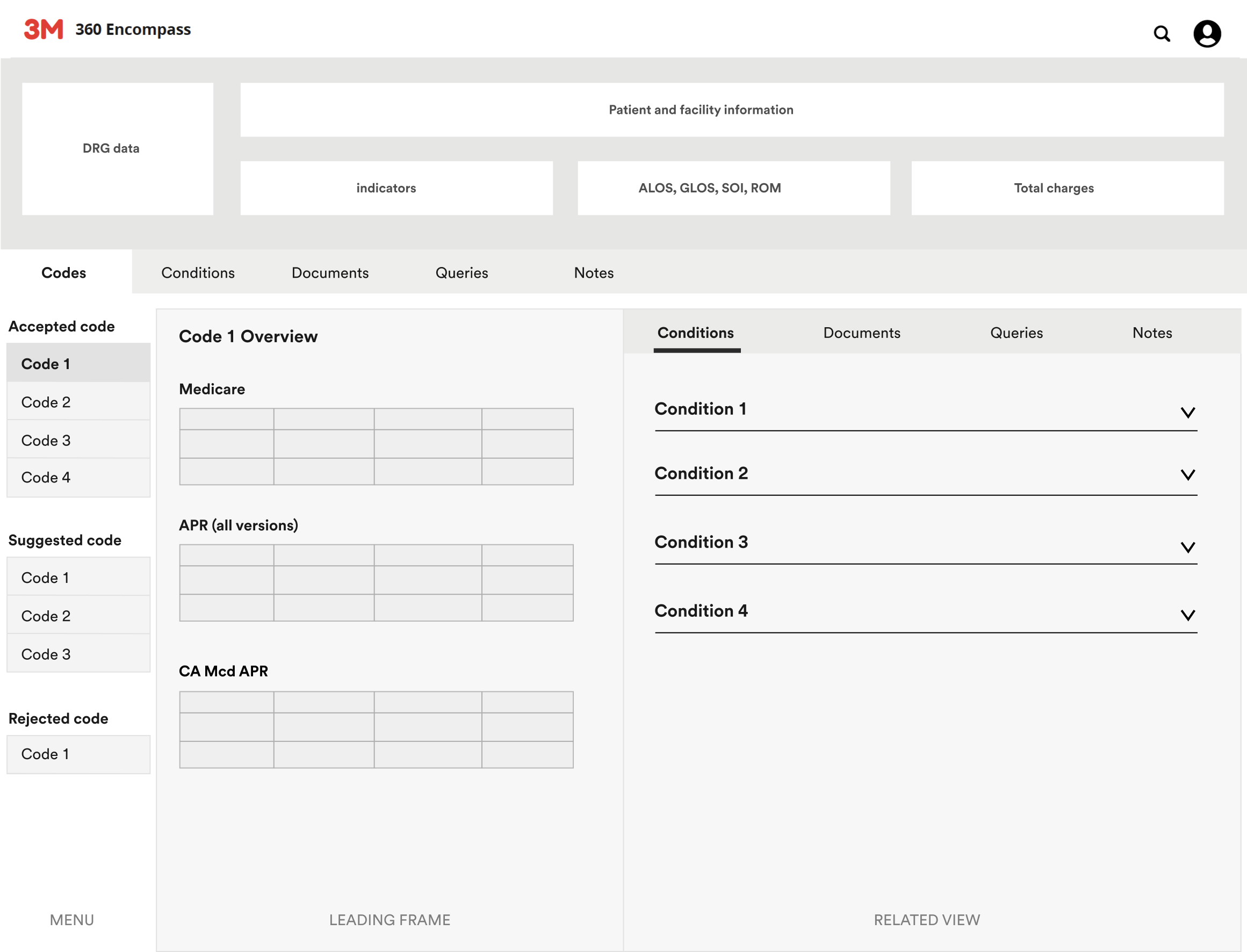
1. Using Codes view to learn about potential condition
CDIs previously struggled to connect codes with conditions as this journey was not possible in the past experience. Our new interface streamlines this by directly linking codes to their relevant conditions, making it easier for the users to identify them.
User flow:
When the user arrives at the page from any other view, the first code in the MENU is pre-selected. They can view accepted, suggested and rejected codes based on the given case. From that selected code in the MENU, CDIs get the potential conditions associated with the code in the RELATED view.
CDIs can select any condition and learn more details about it.
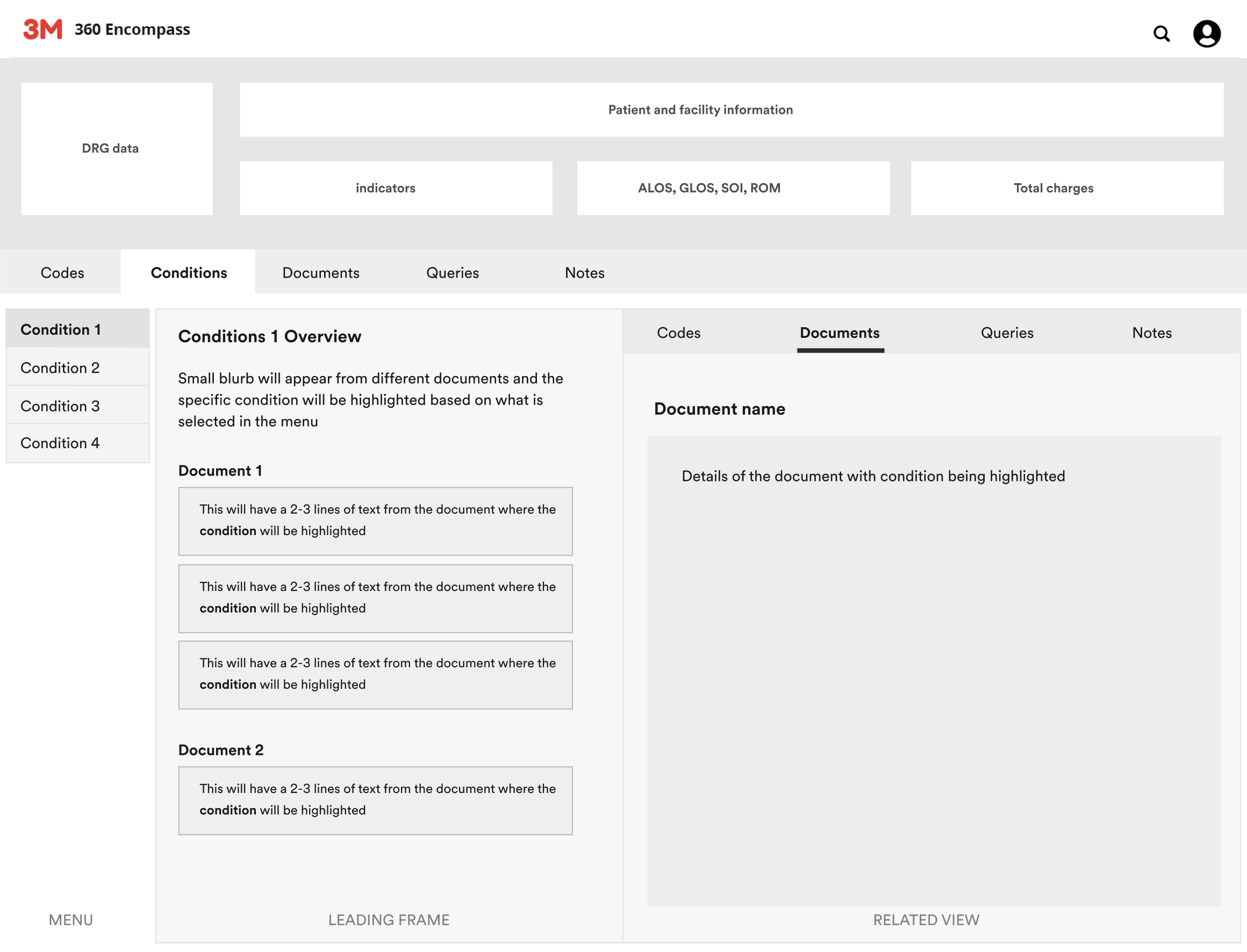
2. Using Condition view to pin point potental conditions in the documents
Previously, CDIs struggled to find specific conditions when sifting through lengthy documents, causing frustration, especially in complex cases. We've improved this by linking and highlighting conditions directly to relevant documents, allowing CDIs to easily view references and ask questions.
User flow:
When the user arrives at the page from any other view, the first condition in the MENU is pre-selected. The user will see excerpts from different documents with the selected condition bolded and underlined. Once the user selects which of the excerpts they want to view, the whole document will appear in the RELATED view with the selected condition again bolded and underlined.
This will allow users to quickly find information within long documents.
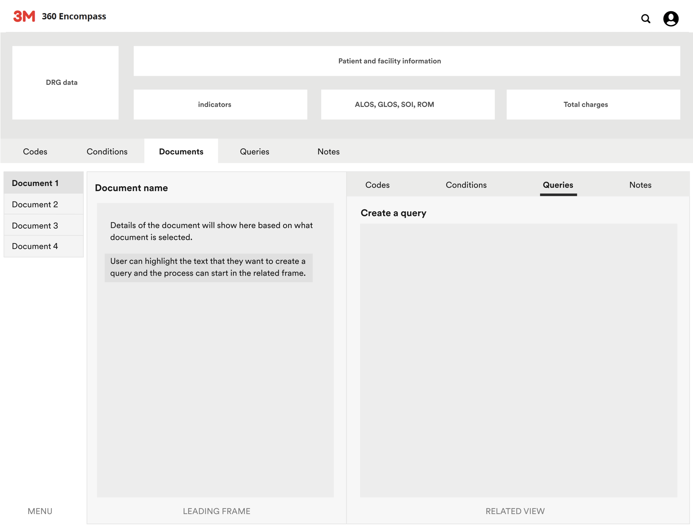
3. Using Documents view to create a Query
Previously, the process for users to create queries was completely disjointed. Most of the time, they had to use email in order to communicate. We integrated query functionality within the Documents view, enhancing transparency and simplifying communication. Now, CDIs can directly create queries and communicate with providers without resorting to email.
User flow:
When the user arrives at the page from any other view, the first document in the MENU is pre-selected. User will get details of the selected document in the LEADING view. If anything is unclear, they can highlight the text in the document and create a query.
The process of creating the query will start in the RELATED view.
Wireframe (hi-fidelity) - Structure Redesign
Once our designs were approved and we had mapped out the content and the interactions, we started to fill in more details for next stage of the designs.
Wireframes (hi-fidelity)
Using Code view to learn about potential conditions
Problem:
This journey was not possible in the past as users could only start the coding process from the "Documents and Codes" view. CDIs faced challenges as they were forced to dig around in the system when trying to link codes with potential conditions because the connections between the two were non existant.
Solution
Our new interface directly links codes with conditions, streamlining the process and making it easier for users to identify the relevant conditions. This journey eliminated one of the major pain points for CDIs, as they now get important information at logical and relevant decision points.
Video: In this user journey, the CDI has both the "Codes" and "Conditions" tabs open, with “Tachycardia, unspecified” preselected. The corresponding condition is highlighted under the "Conditions" tab.
As "Tachycardia" is no longer needed, the CDI moves it to "Rejected Codes," and the system automatically selects the next code, "Fluoroscopy...", highlighting its related condition. For more information on “Heart Failure,” the CDI can click on the accordion to view excerpts from the attached documents, where "Heart Failure" is highlighted for easier clarification.
Using Condition view to pin point potental conditions in the documents
Problem:
CDIs had to sift through lengthy documents to find specific mentions of conditions. This process was particularly frustrating in complex cases, as the conditions were not easily visible or linked within the documents.
Solution
Our new interface highlights conditions in documents, streamlining the process and helping CDIs quickly identify relevant information. This is especially valuable when time is limited and they would otherwise need to go through lengthy documents.
Video: In this user journey, the CDI has the "Conditions" and "Documents" tabs open, with "Hypertension" preselected. No documents are shown until something is selected in the LEADING view.
When the CDI selects "Heart Failure," they can view document excerpts in the LEADING view, with "Heart Failure" highlighted. If they want to see the "History of Present Illness" within the History and Physical document, the full document appears in the RELATED view, with both the section and condition highlighted. The same steps apply when viewing the "Progress" section in the Progress Note document.
Using Documents view to create a Query
Problem:
Before creation of queries was a completely disconnected and confusing process.
Solution
To fix this, we incorporated a query functionality within the Documents view so users can directly create queries from the documents which increases transparency.
Video: In this user journey, the CDI has the "Documents" and "Queries" tabs open, with "History and physical" document preselected.
In this journey, if CDI wants to create a query in the "History of present illness" section within the "History and Physical" document, they right click, and add a highlight. They proceed to create a query, which takes place in the RELATED VIEW. Once the query is created, the selected section of the text gets highlighted in blue to signify the presence of a query.
Achievements
- Having left and right navigation that connected with each other significantly reduced the confusion for our users.
- The overall design reduced clutter and made it easy for our users to perform their tasks. The previous design was complicated, so simplifying the process was essential.
- The old interface had too many repetitive navigation choices which led users to the same end point. We removed most of them and simplified the interface.
- We directly connected communication tools in the application so users don’t have to rely on other outside channels.
- Most importantly, we presented users with relevant information at important decision points which reduced the users' frustration.
Paranomic Application Design
Aligned vision and function with business team. Created effective user experience, participated in usability testing and contributed to pattern library.
